Mind the Errors

Submitted by Kevin Jardine on 14 September, 2016 - 00:07

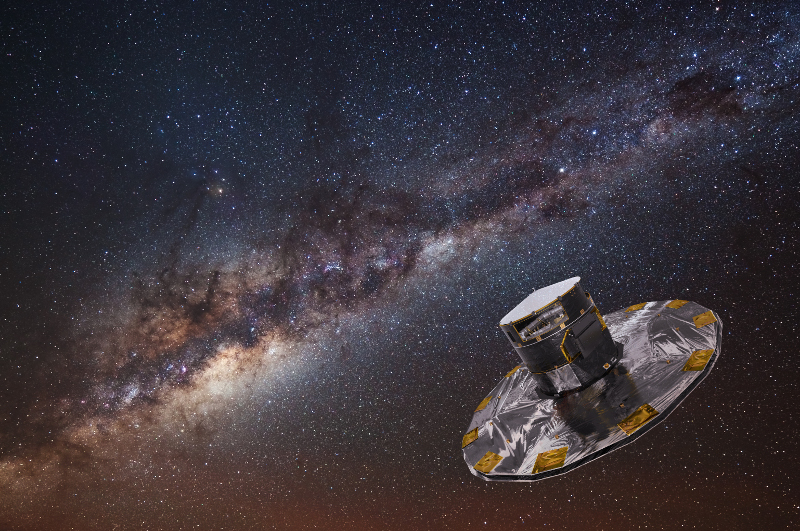
The first data release of the Gaia star mapping mission is coming out tomorrow. The release is creating a lot of understandable excitement but be careful! The Gaia scientists have already announced the parallax errors and for many of the first release stars they are similar to the previous Hipparcos mission, not the revolutionary accuracy expected by the end of the Gaia mission.

The limited accuracy in this first release is not because of a malfunction in the Gaia machinery but because the data is derived by combining the very first Gaia observations with the star positions and motions given in the older Tycho-2 catalog. This combination, the Tycho Gaia Astrometric Solution (TGAS), is in one way a bit of a data hack, but it does dramatically increase the number of stars with Hipparcos level accuracy from 100 thousand in the original Hipparcos catalog to about 2 million. This delivers a much more detailed map for the near solar neighbourhood (out to about 100-200 parsecs or 330-660 light years).

It is worth spending a bit of time looking at parallax error and how it determines the size of accurate star maps.

One reason that professional astronomers almost exclusively use parsecs when discussing distances within the Milky Way is that it is easy to convert parallax into parsecs. The formula could not be simpler. If we know that the parallax for a star is p arcseconds, then the distance d to the star in parsecs is given by the formula:

d = 1/p

However, even an incredibly accurate device like Gaia cannot measure parallax with complete accuracy and so both the Hipparcos and Gaia catalogs provide a standard error value measured in milliarcsecond standard deviations.

If you remember your stats classes, you will know that the odds of a correct value appearing within one standard deviation if the errors are normally distributed are 68%, within 2 standard deviations, 95%, and within 3 standard deviations 99.7%.

The Hipparcos median parallax error was about 1 milliarcsecond, so if you wanted to produce a map where the star positions were fairly accurate, you would likely go for two standard deviations, which in the Hipparcos case would be 2 milliarcseconds.

This accuracy standard puts strong limitations on the size of the map. A star with a distance of 100 parsecs has a parallax of 10 milliarcseconds. Using two Hipparcos standard deviations, this means that there is a 95% chance that a star with a measured parallax of 10 milliarcseconds falls within a real parallax of 10±2 milliarcseconds. This corresponds to a distance between 1000/(10+2) = 83 parsecs and 1000/(10-2) = 125 parsecs.

What this calculation shows is that if we use the Hipparcos data out to about 100 parsecs then we are 95% sure that the distances are accurate to about 25%.

Some Hipparcos stars have better than a 1 millisecond error, so if we filter to a list smaller than the 100 thousand stars, we can do better than 25% accuracy and even extend the map (with a loss of detail) to about 200 parsecs or so. If we go beyond about 200 parsecs, however, the parallax errors imply that the odds are remote that distance estimates are accurate for all but a tiny number of stars. So a detailed and reasonably accurate map using Hipparcos is restricted to a region between 100-200 parsecs from the Sun.

Although the overall accuracy of tomorrow's release will be similar to Hipparcos, the much larger number of stars (2 million) means that we can likely extend the map a little further using low error stars and still have significant detail. My hope is that we can even get some details as far away as the Orion nebula (400 parsecs). We'll know soon. My plan is to produce a face-on map as far out as the error values will allow.

Gaia will continue to produce regular data releases. Gaia DR2 will arrive by the end of 2017. So far the signs are still good that Gaia will ultimately meet its objectives and produce parallax data with far higher accuracy, allowing us to map the Milky Way out for thousands of parsecs. I can hardly wait!

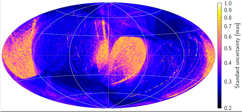
(The parallax error map at the top of this blog post was made available by ESA before the Gaia release.)

The Day of Gaia

Submitted by Kevin Jardine on 12 September, 2016 - 21:05

It's difficult to overestimate the importance of the Gaia mission, an incredibly intricate double space telescope launched in December 2013 and now mapping the Milky Way. We'd have to go back to the rise of the radio telescope in the 1930s to find a development more revolutionary for the exploration of our home galaxy.

Gaia DR1 will be released this Wednesday, September 14 (in most time zones) at 10:30 UTC. This first data release will not be nearly so revolutionary as future releases (see my next blog post for details) but it is an important first step that marks a rite of passage for astronomy as a whole.

What Gaia does better than any instrument ever created is measure the tiny shifts in apparent position that stars undergo as the observatory orbits the Sun and even between the two views of its precisely angled double telescopes. These shifts, called parallax, can be used to estimate a star's distance, much like surveyors use much larger parallax values to estimate the distances to buildings or mountains here on Earth.

Measuring the tiny shifts of star position to determine parallax requires Gaia to be incredibly precise - enough to measure the size of a Euro coin or North American quarter as it would appear on the surface of the Moon!

Up to this point, astronomers have largely used unreliable and sometimes frankly dodgy techniques like kinematic distance (based on rough models of gas rotating around the galactic nucleus) or photometric distance (based on guesses of the temperature of stars and the location and density of dust clouds that obscure our view of them). Both kinematic and photometric estimates require major assumptions that might turn out (and often do turn out) to be incorrect. Parallax is the gold standard of distance estimation. And distance is the key to all astronomy. We need to know how far away a star is to determine its size, its age, and its local environment.

This site, Galaxy Map, currently displays maps based on inconsistent and often incorrect distance estimates. That is about to change. A dream only seen in science fiction is about to come true: Gaia will allow detailed, extensive and accurate 3D maps of much of the Milky Way for the first time.

To see what a revolution Gaia brings, we can compare it with its pioneering predecessor, Hipparcos, launched in 1989. The Hipparcos results were accurate within one milliarcsecond for about 100 thousand stars, which was excellent using the technology available at the time.

Hipparcos created a map that was accurate to between 100-200 parsecs (330 to 660 light years). Even at the high end, this is only half way to the Orion nebula and does not even map out of much of our local solar neighbourhood, the Gould belt.

Gaia, on the other hand, has the goal of determining distance estimates for a billion stars. For the brightest 46 million stars, the mission scientists expect an accuracy of 26 microarcseconds, almost 40 times more accurate than Hipparcos. With this level of accuracy (if my calculations are correct), Gaia can determine the distance to stars in the near 3 kpc arm, which borders the galactic bar, to within 15%, and the distance to the stars in the closest Perseus and Sagittarius spiral arms to within 5%.

All of this is still in the future, however. As you'll see in my next blog post, the first data release delivers something similar to Hipparcos accuracy, albeit for 2 million stars. So it will largely offer a much more detailed map of the territory covered by the previous mission.

Examining the elephant

Submitted by Kevin Jardine on 15 August, 2014 - 20:29

When astronomers examine the Milky Way galaxy, they are like the blind people examining the elephant in the old folk tale.

Just as each person in the story examined only one part of the elephant, so astronomers must work from limited information. Often arguments about whether the Milky Way has two, three, four or even five major spiral arms depend upon whether one is looking at radio or infrared frequencies, examining cold hydrogen gas or hot young stars, or building models using strict logarithmic spirals or more complex structures.

For this reason, the two main data collections on this site, the Milky Way Explorer and the Velocity Explorer, try to combine data from many different sources.

For the past few years, I have put a lot of effort into expanding the range of electromagnetic frequencies available through the Milky Way Explorer, from gamma rays and x-rays, visible light, infrared, millimeter waves and radio. Each frequency adds more detail to a complex picture.

However, frequency data alone is projected on a two-dimensional sphere, and cannot by itself help us build a full three dimensional map of the Milky Way. For this reason I have added a completely different approach, the Velocity Explorer, which maps the velocity of hydrogen and molecular gas and provides clues to the full three dimensional structure of the galaxy as explained in the section on Velocity.

Today I introduced a major new feature to the Velocity Explorer - two new images which overlay velocity data from three recent catalogs of objects that trace spiral structure, including young stars, masers and HII regions. By and large (but not always!) the velocity of these denser objects is consistent with the velocity of the atomic hydrogen and molecular gas.

To make a comparison with terrestrial cartography, the gas clouds are the broad continental boundaries, whereas the new velocity data shows star formation regions that are like the major population centres. If we mapped the Earth by only including large cities, we would miss large parts of Canada, Russia and Australia (not to mention the entire continent of Antarctica!). Conversely, if we left out the cities, we would leave out much that is of interest to human beings.

You can plunge right into the new overlay images in atomic hydrogen and molecular gas but you will need to read the introduction to the Velocity Explorer and perhaps the whole section on this site on mapping hydrogen gas to get some context.

Here are the sources for the coloured dots that appear as an overlay on the new images:

  • the RMS (Red MSX Source) survey (link) (with the planetary nebulae removed), in cyan (blue-green) dots,
  • The 6-GHz methanol multibeam maser catalog (link), in green, and
  • The BeSSeL VLBI maser parallax survey (link and related papers), in yellow.

The Perseus arm and the RMS data

Submitted by Kevin Jardine on 13 July, 2014 - 15:38

The Perseus arm may not be a single structure, as I discussed in a previous blog post. In this blog post, I discuss the evidence in the RMS data that the outer Perseus arm is actually a branch of the Norma arm and is not connected to the Perseus structure detected in the inner galaxy.

The image below is a detail of the overlay illustration from my first RMS blog post. The Milky War model from this site is overlaid by Robert Hurt's Milky Way illustration, which in turn is overlaid by the RMS data. The Perseus arm is in red, the Norma arm is yellow, and various smaller non-spiral structures are shown in orange. The RMS data shows complexes of massive young stellar objects and HII regions (blue circles) and individual objects (red circles). You can view a larger and more detailed version by clicking on the image.

In the atomic hydrogen velocity data from the Leiden-Argentine-Bonn survey, there is a prominent structure that appears to lie between the Perseus and Norma arms in the first and second quadrants. I called this structure the Cygnet spur.

After Zhang, Reid et.al 2013 reported a gap in the Perseus arm between 50° < l < 80°, I re-examined the evidence for the Cygnet spur and suggested in a blog post that:

Instead of considering the Cygnet velocity structure as a spur, it may actually reveal that the outer Perseus arm branches off the Norma arm.

The RMS data provides more evidence for this branch.

In the image below, I have highlighted the two sections of the Perseus arm.

The RMS data shows a clear gap in the Perseus arm between 50° < l < 80°, with only one small source in this region, providing more evidence that this arm may not be a single structure. In contrast, the RMS data shows many large sources connecting the Outer Perseus arm to the Norma arm. This is also consistent with the hydrogen data and provides a better explanation for the hydrogen velocity in this direction than a spur.

The Peninsula

Submitted by Kevin Jardine on 10 July, 2014 - 10:06

Simple mathematical patterns are seductive. Our brains and in particular, our visual processing systems, are pre-programmed to see them everywhere, even if they do not exist.
Whirlpool galaxy from Hubble
Disk galaxies are a good example. Hydrogen clouds, star formation regions and dust in disk galaxies often seem concentrated in prominent arms that are typically mathematically modelled using logarithmic spirals. However, a simple mathematical model, while tempting, can be actively misleading. If we carefully examine even grand design spiral galaxies such as the Whirlpool galaxy, Messier 51, shown to the right, we can see deviations from a simple spiral pattern, including shorter non-spiral arms, changes in arm thickness, and small "feathers" that connect the larger arms together.

It is often the deviations from a spiral pattern that are the most interesting features of a disk galaxy like the Milky Way.

This is why the RMS data discussed in my last two blog posts is so important. By providing distance estimates for HII regions and massive young stellar objects throughout the galaxy and well beyond what has been mapped using parallax alone, the RMS data provides the beginning of a real portrait of our home galaxy, revealing some of the unique features that are distinct from a mere mathematical model.

In this blog post I discuss what appears to be one of the most prominent deviations from spiral structure in the Milky Way: a vast structure in the inner galaxy that I've called the Peninsula.

I initially suggested the existence of the Peninsula when examining the mystery of RCW 122. RCW 122 is an enormous star formation region in the inner galaxy, especially prominent in images from the Spitzer infrared space telescope. The published radio parallax-based distance estimate of 3380 (-270 / +330) parsecs does not place it near any of the spiral arms or in the 3 kpc arms or bar.

When I examined the atomic hydrogen velocity data more closely, I suggested that a "peninsula" of hydrogen gas extended from the Norma arm towards the bar and that RCW 122 was part of this structure.
Peninsula in RMS overlay
The RMS data suggests that the Peninsula is real and is larger and more prominent than I had imagined.

In the rough diagram at the end of my article on RCW 122, I had shown the star formation region at the end of the Peninsula. However, the RMS data suggests that the Peninsula is much larger than I had estimated and RCW 122 is located in about the middle of this vast structure extending from the Norma arm towards the galactic bar.

The illustration to the left is a detail of the larger overlay image from my first RMS blog post. The image shows the Milky Way model from this site overlaid by the Hurt illustration, which is overlaid again by the RMS data. The Norma arm is in yellow. The RMS data shows complexes of massive young stellar objects and HII regions (blue circles) and individual objects (red circles). You can view a larger and more detailed version by clicking on the image.

As I pointed out in my previous blog post, the Hurt illustration appears to be inaccurate in the fourth quadrant. I discussed the position of the Sagittarius arm in my last blog post. In the overlay illustration both the RMS data and my own Milky Way model suggest that the Norma arm is more substantial and further away from the galactic bar than shown in the Hurt illustration.

All of this is not to say that adding the Peninsula to a model of the Milky Way explains the positions of all the known star formation regions. The RMS data shows two twin "islands" made up of many star formation regions that appear to float well beyond the Peninsula between the Norma arm and the bar. More mysteries to explore!

Pages

Subscribe to Galaxy Map RSS