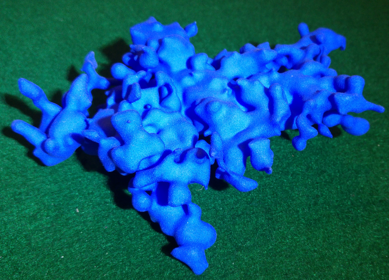
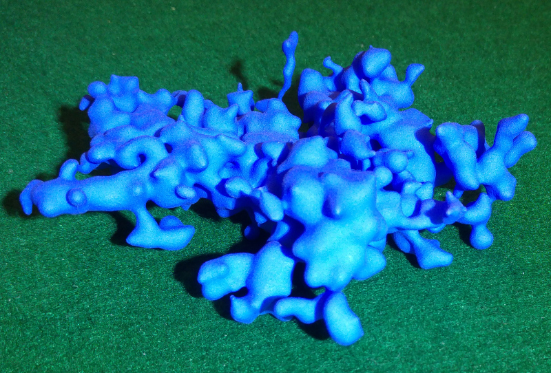
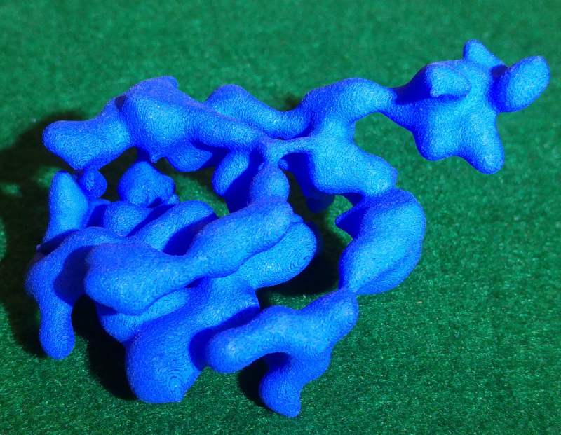
A video showing me unbox a 3D print of the main region in the hot 17% isosurface:
Some still images of the 3D print:
Southern stars with Orion peninsula in the foreground, Per OB3 at left, Sco OB2 at top:
Southern stars. Sco OB2, M7 and LP Trianguli Australis region in foreground, NGC 3532 at left (notice the vertical stream of stars left of Orion!):
Northern stars, Cep OB6 and zeta Cephei complex in foreground, Sheliak highway in background:
(The Sheliak highway is a long stream of stars above the galactic plane that starts in the region surrounding Sheliak (beta Lyrae, at the left of this image) and then extends to the right.)
Here is a Blender animation combining higher density hot (blue) and bright (green) star density meshes. The sun is the dot at the rotation centre:
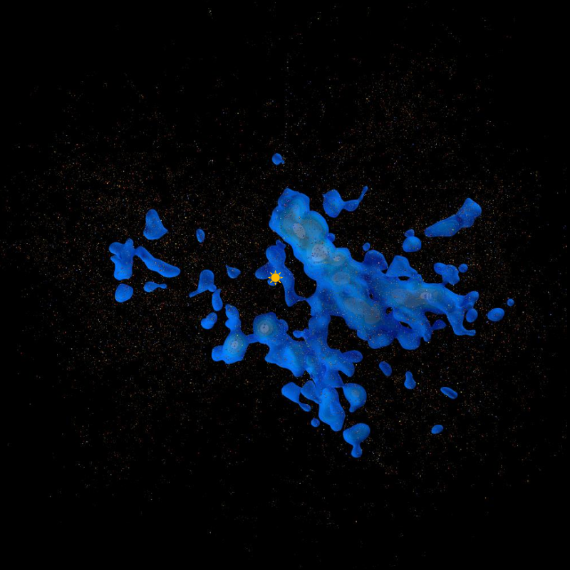
This image shows dust (reddish brown), hot star clouds (blue) and bright star clouds (green) in the solar neighbourhood within 650 parsecs (2100 ly). The direction to the galactic centre is at the top.
My first map of the solar neighbourhood, released in February 2017, had a number of limitations and a couple of significant errors. This second attempt fills in some gaps and corrects the known errors.
This map version also includes 32 thousand "beacon" stars - bright stars contained in the dense star clouds within 650 parsecs or about 2100 light years. The region names in this version are based on star clusters or extremely bright stars contained within the region.
Filling in missing data
The TGAS data set released as part of Gaia DR1 is known to be missing many stars. Not only are stars missing in certain underscanned directions, but Gaia is missing high proper motion stars, many relatively bright stars, and stars that are very blue or very red. Unfortunately many of these stars are the ones that are needed to construct a map, especially within a few hundred parsecs.
In this map version I have used the older Hipparcos data set to add missing bright stars within about 300 parsecs. This is a useful stop gap until Gaia DR2 is released in April 2018.
Colour errors
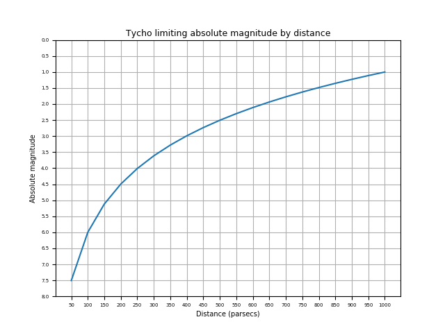
In my previous map I used the Tycho-2 database to determine star colours as the Gaia-determined colours will not be available until DR2. However I did not consider the colour errors given in the Tycho-2 catalog and as a result, many of the stars I included in my "hot" star map are in fact of unknown temperature. In this version of the map, I have excluded all stars with a colour error greater than 0.1 and, further, at the suggestion of Gaia scientist Ronald Drimmel, I have excluded all stars with a relative magnitude dimmer than magnitude 11 as dimmer Tycho-2 stars are known to have dubious colour values.
Magnitude filtering
In my previous map I did not take into account the fact that the Tycho-2 catalog is itself very incomplete, especially for stars dimmer than relative magnitude 11. After I filtered out the stars dimmer than relative magnitude 11 to deal with the colour errors, I realised that this also imposed a limit on the absolute magnitudes of the stars I used to construct a map. Here is the graph showing the absolute magnitudes of stars with relative magnitude 11 out to various distances:
After some analysis I decided to make the second version of the map out to 650 parsecs. In order to ensure that my selection of stars was even reasonably complete out to that distance, a look at this chart showed that I needed to filter my list to stars brighter than absolute magnitude 1.5 (or so, making the limit slightly more restrictive than the chart allowed for some dust obscuration as well).
Outcome
Adding missing stars from Hipparcos expanded my star list, but filtering out dim stars considerably restricted it. My new map is constructed using about 140 thousand bright stars (1.5 absolute magnitude or brighter) including about 3400 hot stars (colour index < -0.02, corresponding to O and B class stars).
This second map version looks quite different from the first version. The first version showed three separate star concentrations or stellar continents. The second version fills in the gaps between these continents. There are now two major star concentrations, which I have called the Northern and Southern stars. I will look at these star concentrations in more detail in a future blog post.
The map application
There is much else I want to show including 3D meshes, animations etc., but this blog post has gone on long enough so it is time for the link to the map application itself:
I've added more configuration options to add different densities of bright and hot isosurfaces, turn on or off the dust clouds, and display different kinds of labels. You can read more about the map controls by clicking on the Help link at the bottom of the control area on the upper right.
Also note that at the highest zoom level you can hover over individual stars for names and distances above and below the galactic plane, and click on individual stars for more details. Click on the Help link below the map controls for more information. The JSON loading of the star data may slow down less powerful devices - I am looking into speeding that up as well as tweaking the display to work better with mobile devices.
Accuracy
I am confident that this map is more accurate than the first version because the hot star densities now correspond closely to the Hipparcos map shown in the paper:
Bouy, H., and J. Alves. "Cosmography of OB stars in the solar neighbourhood." Astronomy & Astrophysics 584 (2015): A26.
Compare the dense hot star clouds shown in this image from the second version of my map:
Many of the structures line up after a 90 degree rotation.
Having said that, I can see some more improvement possibilities so there may be a third map version before Gaia DR2 in April 2018 allows for a much better map of a large part of the galaxy. Exciting times ahead!
Flocks of birds, schools of fish and concentrations of stars can all be mapped using isosurfaces.
The TGAS (Tycho-Gaia Astrometric Solution) data set released as part of Gaia DR1 in September 2016 contains positions and parallaxes for 2057050 stars, about 85% of the 2432906 stars in the Tycho-2 catalog. This is the first time that parallaxes (and hence distance estimates) have been available for such a large number of stars.
Nevertheless, TGAS contains a tiny fraction of the hundreds of millions of star parallaxes that will be released as part of Gaia DR2, currently scheduled for April 2018.
How can we construct a map from such an enormous amount of information?
Isosurfaces
We know already that stars are not distributed randomly but are found in vast concentrations, much like flocks of birds or schools of fish on Earth. These concentrations range in scale from systems with multiple stars, clusters, and associations all the way up to spiral arms. There is structure at every scale. One important tool to map this stellar distribution is isosurfaces of constant star density.
Isosurfaces are the three-dimensional equivalent of the isolines on a topographic elevation map.
Isosurfaces fit inside each other like complex Russian nesting dolls.
An algorithm for converting the point set of a scalar field with a given value into a surface mesh was invented by William E. Lorensen and Harvey E. Cline and published in 1987. The marching cubes algorithm is most often used to convert MRI scans into images of tissues and bones for medical diagnosis and research. It has many other uses for scalar fields, including the analysis of stellar distribution.
We can think of the isosurfaces generated by the marching cubes algorithm as the three dimensional equivalent of the isolines used in topographic maps to show lines of constant elevation. In an elevation map, lines representing higher elevation appear inside lines representing lower elevation. The sequence of isolines of increasing elevation define a mountain peak. Similarly, a sequence of isosurfaces representing increasing star density represents a "star peak".
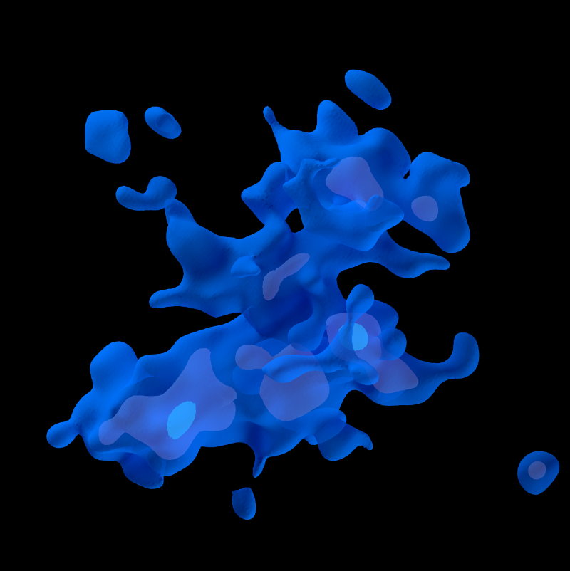
One difficulty in visualizing isosurfaces is that they are three-dimensional structures and representing a sequence of isosurfaces enclosing each other is often confusing and difficult to interpret - a bit like a series of very complex Russian nesting dolls. We can use translucent surfaces to represent a few enclosed surfaces as in this image:
However, for a larger sequence of isosurfaces, an animation that shows less dense isosurfaces fading or evaporating to reveal denser surfaces inside is often clearer.
Star selection
Converting the Gaia parallax data into density isosurfaces is straightforward. First I select the most accurate parallax data with error/parallax < 0.2. There are about a million stars in the TGAS data set with this parallax accuracy. A second step is required because simply computing density surfaces of this data set does not give a map of the solar neighbourhood! Instead it returns a sequence of nested ellipsoids. This is because an unfiltered analysis is limited by what Gaia can see and Gaia sees more stars at shorter distances than further away. What we need to do to produce a map is to select stars that Gaia can see out to a reasonable distance of 600-800 parsecs. So we need intrinsically bright stars to construct a map.
After some experimenting, I found two TGAS subsets of the low error stars that generate reasonable maps. The first is the 400 thousand "bright" stars with absolute magnitude <= 3 (remember that the brighter the star, the lower the magnitude value). The second is the 20 thousand "hot" stars with colour index <= 0. Except for some very dim but hot white dwarfs close to the Sun, the hot stars are essentially a subset of the bright stars in the TGAS data set.
For each of these "bright" and "hot" star sets, I convert the parallax and positions into (x,y,z) coordinates and then count the stars in each 2x2x2 parsec bin.
In order to produce reasonably smooth isosurfaces, I then used a gaussian smoothing function (usually with a sigma of 15 parsecs) to produce a scalar field defined within a cube with a radius of 800 parsecs from the Sun. The scalar density field can then be converted into isosurface meshes using the marching cubes algorithm mentioned above.
You can see an animation showing the lower density bright isosurfaces fading into higher density surfaces below. The bright star isosurfaces dissolve from the low density 20% isosurface by 5% increments until they reach the high density 95% bright star isosurface. (The percentages used to define isosurfaces are always a percentage of the maximum density found in the data set. So a 40% isosurface contains all the stars with a density that is 40% or more of the maximum value.)
In this animation, the Sun is at the centre and the direction to the galactic nucleus (0° galactic longitude) is at the top.
A similar animation for hot isosurfaces is here:
Bright versus hot stars
Because the hot stars are essentially a subset of the bright stars, it is tempting to think that the regions within the bright star isosurfaces always contain a hot star core, much like human tissue is supported by a bony skeleton, but this is not the case! There are significant bright star concentrations that contain no hot star cores.
As I explained in my previous blog post, the dense hot star concentrations within the TGAS data are found largely within three major regions, or stellar continents. The bright stars, on the other hand, form a ring around the local bubble. As a result, there are large concentrations of bright stars found between the hot star continents, especially in the hot star gaps I've nicknamed the Strait of Centaurus and the Gulf of Auriga.
I've created a few animations to make the differences between the bright star and hot star concentrations clearer.
The first example shows the above bright star dissolve animation (this time in green) and within this dissolve, I have included the 40% hot star isosurface (in blue). You can see how the blue hot star isosurface is embedded within the green bright star isosurfaces, but also how there are bright stars located where there is no hot star core.
Here is a similar example, except that this time the bright star dissolve reveals the 50% hot star isosurface:
And the 60% hot star isosurface:
And the 70% hot star isosurface:
The difference between the distribution of the hot and bright stars tells us that mapping stars in the galaxy is not as straightforward as mapping land on the Earth. Depending upon the stars we select, many maps are possible.
I have used the TGAS (Tycho-Gaia Astrometric Solution) data released as part of Gaia DR1 to create a topographic map of the solar neighbourhood within a distance of 800 parsecs.
Caveats
Links to various ways to see the map are below. First, some caveats:
The TGAS data is known to be incomplete. A more complete and accurate data set extending far beyond the solar neighbourhood into the spiral arms and the galactic nucleus is scheduled to be released in April 2018. For now TGAS is the best data we have for mapping the Milky Way.
This is a topographic map showing isosurfaces of constant star density and is analogous to a hiking map showing isolines of constant elevation. If you want a visualization showing, for example, what it would be like to fly through the Hyades cluster, this is not it. For direct visualizations of the star data, you might want to look at Gaia Sky.
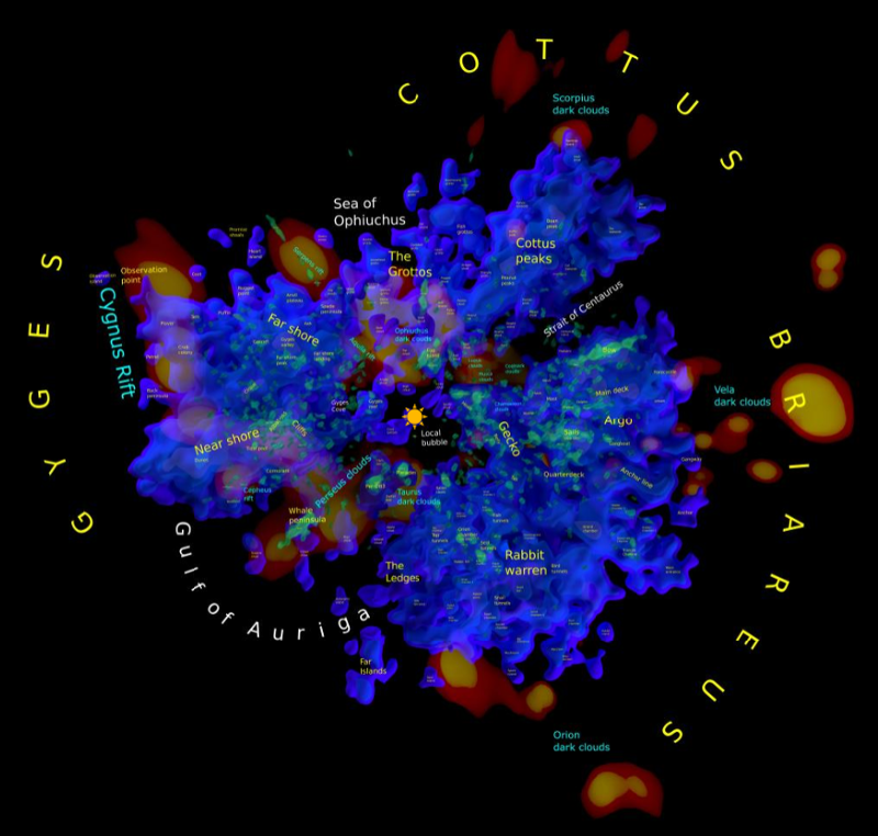
When generating the map, I created names for several hundred isosurface peaks, analogous to mountain peaks or ranges on a hiking map. Although in many cases these names have been inspired by Greek mythology or other traditional star lore, the names are in no way official and were created largely because it is easier for me to remember them and their locations on the map than isosurface region identifiers like TR1 40-54. Only the International Astronomical Union (IAU) can give official names to celestial objects.
The density functions
The isosurfaces on this map are each defined by a density value. The density value is determined by a star density function. There are two density functions used for this map. The first is computed from 20 thousand hot stars (colour index <= 0). The second is computed from 400 thousand bright stars (absolute magnitude <= 3).
In both cases the density functions are computed by filtering for low error stars in the TGAS data set (err/plx < 0.2), counting the number of stars (hot or bright) in each bin of a 2x2x2 grid and then applying a gaussian smoothing function to define a scalar field for each cubic parsec. For the hot star isosurfaces I used a fairly large gaussian sigma of 15 parsecs. For the bright star isosurfaces I used a smaller gaussian sigma of 5 parsecs, resulting in a larger number of smaller isosurfaces compared to the larger sigma.
The net effect is that the hot star isosurfaces identify large regions in space and the bright star isosurfaces define smaller clumps of bright stars.
The density functions range between 0 and a maximum value. I have used an exponential spread function to normalize this range to between 0 and 1. A specific isosurface can be defined by selecting a value between 0 and 1 (or more conveniently between 0 and 100). The 0% isosurface contains all the density values >= 0 and so in both cases is a solid sphere. As the density value rises, the number of disconnected isosurface regions starts to multiply and their size is reduced. Eventually as the density value reaches 100%, there are only a few very dense star clumps remaining.
Panurania and the stellar continents
As I mentioned in some blog posts last year, the majority of hot stars can be found in a single isosurface up to and including a density value of about 30%. I have called this stellar supercontinent Panurania (Urania being the Muse of Astronomy and a great granddaughter of Ouranos/Uranus, the god of the heavens). It has many branches and empty spaces and resembles a gigantic Red Ridge sponge.
After 30%, Panurania breaks up into three stellar continents. It seems logical to name these after children of Ouranos and Gaia. The most famous of their children, the Titans, have been widely used for names of moons and asteroids. However, besides the Titans, their children also include the Cyclops and the hundred-armed Hecatoncheires, whose names seem much less widely used.
Given that the stellar continents have many branches, I named them after the hundred-armed Hecatoncheires: Briareus, Gyges and Cottus.
Regions
The isosurfaces consist of hundreds (or for some density values thousands) of disconnected regions. I have given each region an identifier using the recommended IAU identifier system: a three character acronym followed by a region identifier. The set of "hot" isosurfaces are called TR1 (TGAS Regions 1) and the set of "bright" isosurfaces are called TR2.
The identifiers are made up of a isosurface density followed by a region number. For example, the Gyges stellar continent is TR1 40-15. This means that each isosurface has a formal identifier (TR1 40-15) as well as a more fanciful name (Gyges).
Some links
There is a lot to say about the map, but only a tiny amount will fit in a single blog post. I want to get on to providing some links.
It is much more difficult to visualize isosurfaces than isolines on a more familiar contour elevation map, because these density isosurfaces are three-dimensional and have complex shapes. When we look at an elevation map, isolines representing higher elevations can be found within isolines representing lower elevations. The same is true for isosurfaces. However, because isosurfaces are 3D, we must visualize surfaces appearing inside other surfaces, much like very complex Russian dolls.
So I have represented the map using many different images, all of which reveal an aspect of the map.
One way to do this is through animations. For example, this video shows a sequence of hot star isosurfaces fading or melting into each other from 20% to 95%. As the animation goes on, denser pockets of hot stars are revealed inside less dense regions:
(I recommend full screen and perhaps loop mode for all the animations I link to as there is a lot to see.)
Unfortunately this animation does not given you an idea of the complex 3D shapes of the isosurfaces. Below is a rotating view of the 40% hot star isosurface. I have simplified it by filtering the regions so that the visible regions contain 5 or more hot stars (the larger regions contain thousands of hot stars):
Even this view does not given you a clear view of the main stellar continents, so I have uploaded the Briareus, Gyges and Cottus isosurfaces to Sketchfab. You can click on each and view them in 3D here:
Gyges has a complex structure, the Gyges reef, that extends below the galactic plane and appears below the local bubble. As I will show in another blog post, the OB association Lac OB1 is part of the Gyges reef
Briareus has a saddle structure with parts that rise well above the galactic plane at either end.
Cottus divides into two parts: the peaks and the grottoes. The peaks rise above the galactic plane and the grottoes descend well below it.
Of course, it is still useful to have a two-dimensional map, so I have provided a pannable and zoomable one here with quite a few viewing options:
I'll have a lot more to say about this 2D map in my next blog post, but for now you can click on the Help link at the bottom of the settings area at the upper right to read more about it.
Finally, I have uploaded the Python code I used to create the map and its various visualizations to GitHub here:
(Note: in all of these images, 0° galactic longitude is at the top, the Sun is at the centre, and the radius of the data is about 800 parsecs.)
Visualising isosurfaces is hard. They fit inside each other like very complex Russian dolls but no technique for showing several isosurfaces at once works perfectly.
A common technique is to make one isosurface partially transparent so you can see one inside the other, as is done in the image at the top of this article (which also includes the local dust clouds in orange and a yellow dot representing the location of the Sun). However, this only works for two or three surfaces and is difficult for the larger less-dense TGAS isosurfaces because of the complex sponge-like structure of the solar neighbourhood.
(The dust clouds in the above image are derived from data presented in this paper:
Lallement, R., Vergely, J. L., Valette, B., Puspitarini, L., Eyer, L., & Casagrande, L. (2014). 3D maps of the local ISM from inversion of individual color excess measurements. Astronomy & Astrophysics, 561, A91.)
Perhaps the simplest isosurface visualisation technique is an animation in which the larger isosurfaces evaporate to reveal the ones inside.
The following Youtube video was created using the hot star density isosurfaces I described in a previous blog post:
(The best view is 4K full screen.)
The lower density surfaces clearly reveal a crater-like structure in the third quadrant. This is caused by missing TGAS data in this quadrant and is not a real structure.
The animation is interesting, however a traditional map requires a still image or at least something that can be labelled.
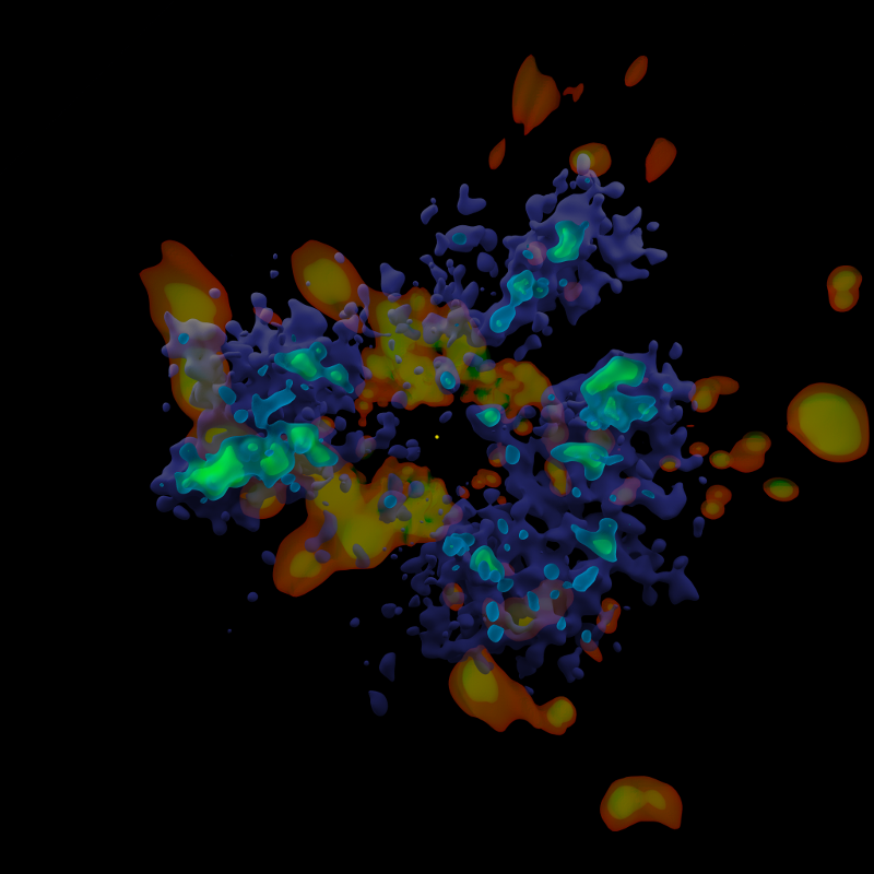
Another option is to overlay several isosurfaces on top of each other. This obscures the three dimensional structure but at least shows how one surface fits inside the other.
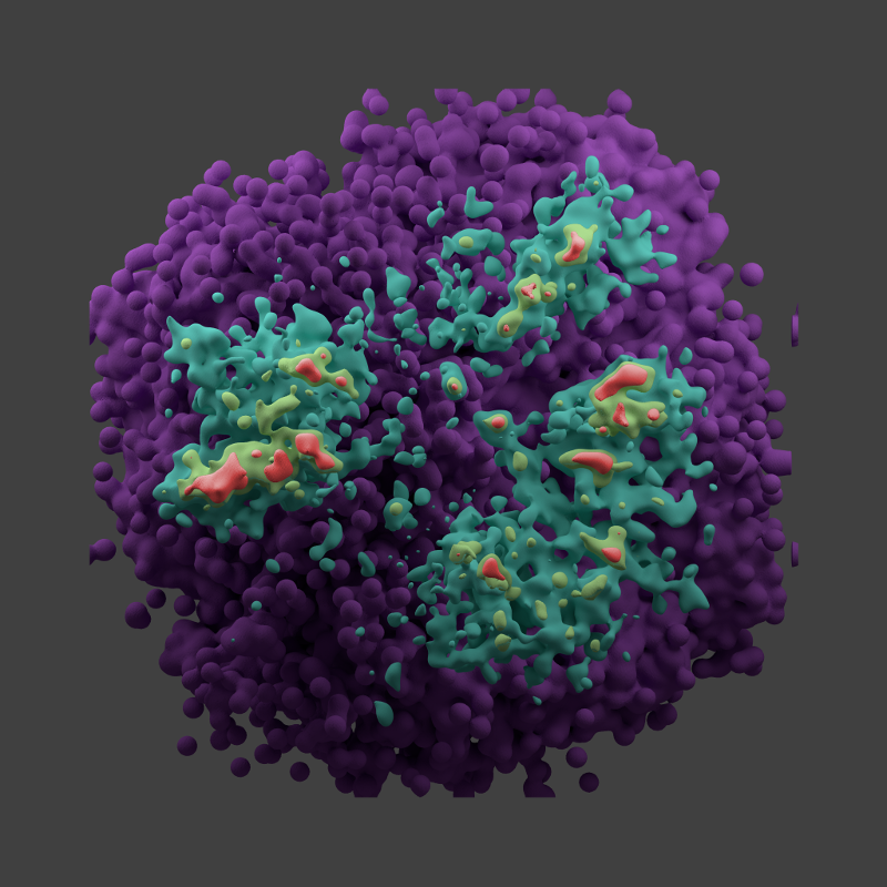
For example, this image shows the isosurfaces for which the star density is greater than or equal to d%, where d is 5, 55, 80 and 90:
The highest 80% and 90% concentrations in this image and the one at the top of this post represent dense hot star concentrations, including OB associations.
You can see the three stellar "continents" of the solar neighbourhood in this image and the one created using three of these isosurfaces at the top of this blog post.
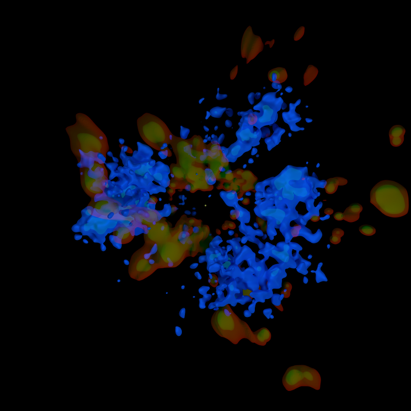
Here's another experiment, this time combining dust and the 60% and 85% isosurfaces:
A successful 3D map of the solar neighbourhood will likely require a combination of these techniques as viewed from several directions.
I hope in my next blog post to present the first draft of a real map of the solar neighbourhood with star clusters, dust clouds, hot star concentrations and labels. Given the limitations of the TGAS data, this first draft will inevitably be incomplete, but it will prepare the way for a more complete map when Gaia DR2 is released about a year from now.
The map will take a while to put together, so look for it early in the new year!