
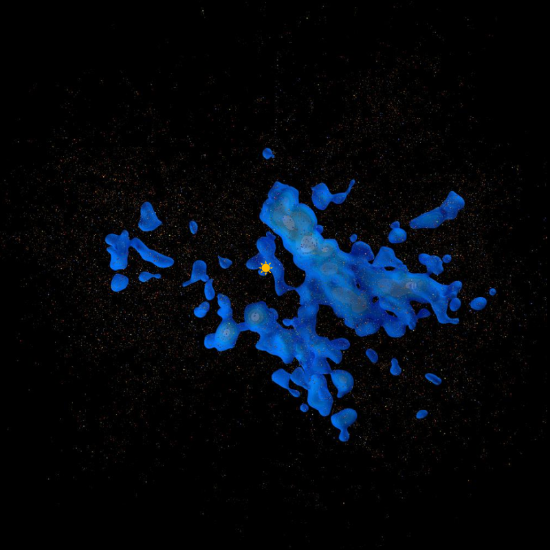
This image shows dust (reddish brown), hot star clouds (blue) and bright star clouds (green) in the solar neighbourhood within 650 parsecs (2100 ly). The direction to the galactic centre is at the top.
My first map of the solar neighbourhood, released in February 2017, had a number of limitations and a couple of significant errors. This second attempt fills in some gaps and corrects the known errors.
This map version also includes 32 thousand "beacon" stars - bright stars contained in the dense star clouds within 650 parsecs or about 2100 light years. The region names in this version are based on star clusters or extremely bright stars contained within the region.
Filling in missing data
The TGAS data set released as part of Gaia DR1 is known to be missing many stars. Not only are stars missing in certain underscanned directions, but Gaia is missing high proper motion stars, many relatively bright stars, and stars that are very blue or very red. Unfortunately many of these stars are the ones that are needed to construct a map, especially within a few hundred parsecs.
In this map version I have used the older Hipparcos data set to add missing bright stars within about 300 parsecs. This is a useful stop gap until Gaia DR2 is released in April 2018.
Colour errors
In my previous map I used the Tycho-2 database to determine star colours as the Gaia-determined colours will not be available until DR2. However I did not consider the colour errors given in the Tycho-2 catalog and as a result, many of the stars I included in my "hot" star map are in fact of unknown temperature. In this version of the map, I have excluded all stars with a colour error greater than 0.1 and, further, at the suggestion of Gaia scientist Ronald Drimmel, I have excluded all stars with a relative magnitude dimmer than magnitude 11 as dimmer Tycho-2 stars are known to have dubious colour values.
Magnitude filtering
In my previous map I did not take into account the fact that the Tycho-2 catalog is itself very incomplete, especially for stars dimmer than relative magnitude 11. After I filtered out the stars dimmer than relative magnitude 11 to deal with the colour errors, I realised that this also imposed a limit on the absolute magnitudes of the stars I used to construct a map. Here is the graph showing the absolute magnitudes of stars with relative magnitude 11 out to various distances:
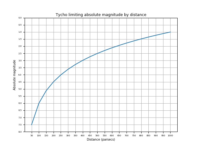
After some analysis I decided to make the second version of the map out to 650 parsecs. In order to ensure that my selection of stars was even reasonably complete out to that distance, a look at this chart showed that I needed to filter my list to stars brighter than absolute magnitude 1.5 (or so, making the limit slightly more restrictive than the chart allowed for some dust obscuration as well).
Outcome
Adding missing stars from Hipparcos expanded my star list, but filtering out dim stars considerably restricted it. My new map is constructed using about 140 thousand bright stars (1.5 absolute magnitude or brighter) including about 3400 hot stars (colour index < -0.02, corresponding to O and B class stars).
This second map version looks quite different from the first version. The first version showed three separate star concentrations or stellar continents. The second version fills in the gaps between these continents. There are now two major star concentrations, which I have called the Northern and Southern stars. I will look at these star concentrations in more detail in a future blog post.
The map application
There is much else I want to show including 3D meshes, animations etc., but this blog post has gone on long enough so it is time for the link to the map application itself:
A topographic map of the solar neighbourhood (version 2)
I've added more configuration options to add different densities of bright and hot isosurfaces, turn on or off the dust clouds, and display different kinds of labels. You can read more about the map controls by clicking on the Help link at the bottom of the control area on the upper right.
Also note that at the highest zoom level you can hover over individual stars for names and distances above and below the galactic plane, and click on individual stars for more details. Click on the Help link below the map controls for more information. The JSON loading of the star data may slow down less powerful devices - I am looking into speeding that up as well as tweaking the display to work better with mobile devices.
Accuracy
I am confident that this map is more accurate than the first version because the hot star densities now correspond closely to the Hipparcos map shown in the paper:
Bouy, H., and J. Alves. "Cosmography of OB stars in the solar neighbourhood." Astronomy & Astrophysics 584 (2015): A26.
Compare the dense hot star clouds shown in this image from the second version of my map:
with the Bouy et.al. map here:
http://sci.esa.int/hipparcos/56834-another-dimension-3d-visualisation-re...
and the 3D display here:
http://sci.esa.int/hipparcos/ob-stars-interactive/
Many of the structures line up after a 90 degree rotation.
Having said that, I can see some more improvement possibilities so there may be a third map version before Gaia DR2 in April 2018 allows for a much better map of a large part of the galaxy. Exciting times ahead!