Making a galaxy map, Part 5: Overlays

Submitted by Kevin Jardine on 22 June, 2018 - 00:22
Galaxy map with
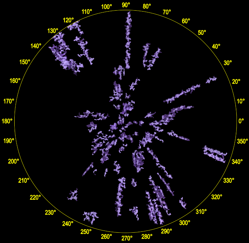
Galaxy map with three mesh sets: very ionizing, some ionizing, and no ionizing with 50 or more stars.

Over the last few blog posts I've outlined the process I used to create a hot star map of the galaxy within 3000 pc. Along the way I mentioned many different choices I made for the map, from star filtering, to density calculations, to mesh selections.

How can we tell that these choices were appropriate and actually created the map I desired?

Answering this question is made more difficult by the revolutionary nature of the Gaia DR2 data set. There has never been a data set large enough and accurate enough to make a map of the galaxy beyond about 300 parsecs before. Gaia DR2 allows a map with a radius that is an order of magnitude larger. There are no other maps for comparison.

There is, fortunately, a very relevant and highly studied set of stars that we can use as a check on the map: the list of known ionizing stars, which is included as an overlay on the map. These extremely hot stars, either Wolf-Rayet stars or stars of class O-B3, emit intense ultraviolet radiation, ionizing any nearby hydrogen clouds by ripping electrons apart from protons, and producing red glowing HII regions visible for thousand of parsecs.

These ionizing stars, and the HII regions they create, are an obvious spiral arm marker in other galaxies, and creating lists of these stars in the Milky Way has been an important project for astronomers interested in mapping our home galaxy.

Roberta Humphreys first published a large list of highly luminous stars, including many ionizing stars, in her highly cited 1978 paper, Studies of luminous stars in nearby galaxies. I. Supergiants and O stars in the Milky Way [ADS link: 1978ApJS...38..309H] It was subsequently expanded by Douglas McElroy and Cindy Blaha and released in 1984. The catalog and a SIMBAD cross match is available from my blog post here.

More recently, researchers have created extensive catalogs of O stars and Wolf-Rayet stars.

Astronomers have also published lists of ionizing stars for individual HII regions. I have compiled these results into a list of more than 700 stars as described in this blog post.

Wright et. al., "The massive star population of Cygnus OB2", Mon. Not. R. Astron. Soc. 449, 741 (2015) have a list of ionizing stars in Vizier.

Finally, almost all of the 340 thousand stars I used to create the map have 2MASS cross matches. About half of these 2MASS identifiers have entries in the SIMBAD astronomical database. I downloaded the basic data for these stars and selected the stars with ionizing spectral types.

After combining all these lists and cross matching with the Gaia DR2 catalog using the 2MASS, Tycho-2 and UCAC4 cross match lists, I ended up with a list of more than 6000 ionizing stars. (I'll include this list in my resource post next week.)

I used the distance estimates from C.A.L. Bailer-Jones et. al. in "Estimating distances from parallaxes IV: Distances to 1.33 billion stars in Gaia Data Release 2" to place the stars on the map. About 5000 of the stars were within 3000 parsecs.

Here are the stars below:

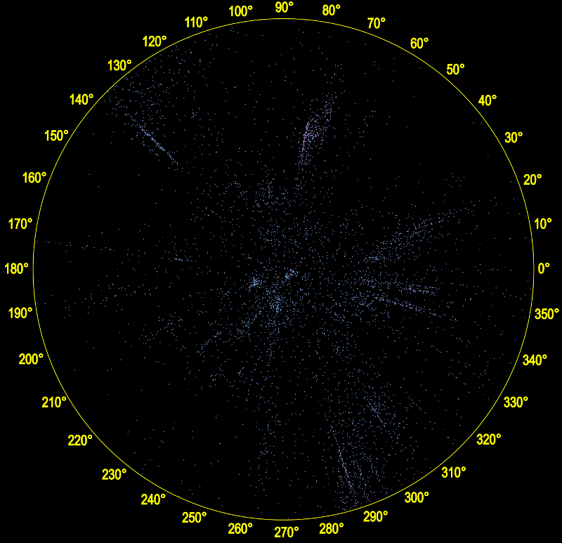
and here is the map with just the very ionizing mesh set:

You can do a more detailed comparison by toggling on and off the ionizing stars on the interactive map site.

I conclude from this comparison that the map includes almost all the regions with known ionizing stars (the main exception in the above image being the highly reddened Cyg OB2 region, which shows up only in the cooler meshes). However the "very ionizing meshes" (which are selected using Gaia DR2 colours) also include a few regions that have few ionizing stars in my list. In a future blog post, I'll look more carefully at these "extra" regions. It will be interesting to see what happens to the map with Gaia DR3, currently expected in late 2020, which should have more accurate photometry.

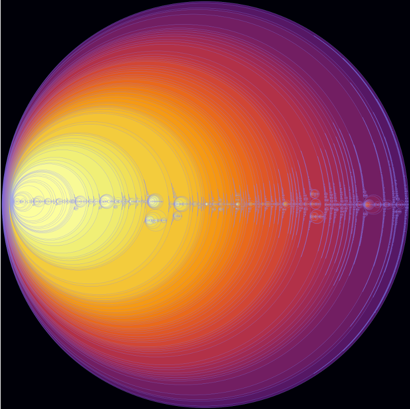
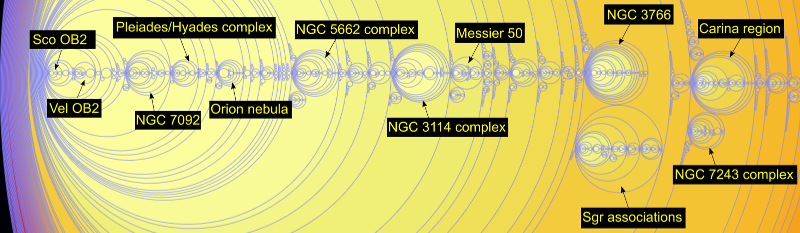
It is also interesting to compare my map with the recently released preprint on star clusters in Gaia DR2:
Cantat-Gaudin, T. et. al., "A Gaia DR2 view of the Open Cluster population in the Milky Way". Unfortunately the electronic data mentioned in that paper does not seem to have been released yet (or at least I cannot find it) so I'll have to resort to some ugly image scraping from the paper. I'll replace this with a proper map when I can get the data:

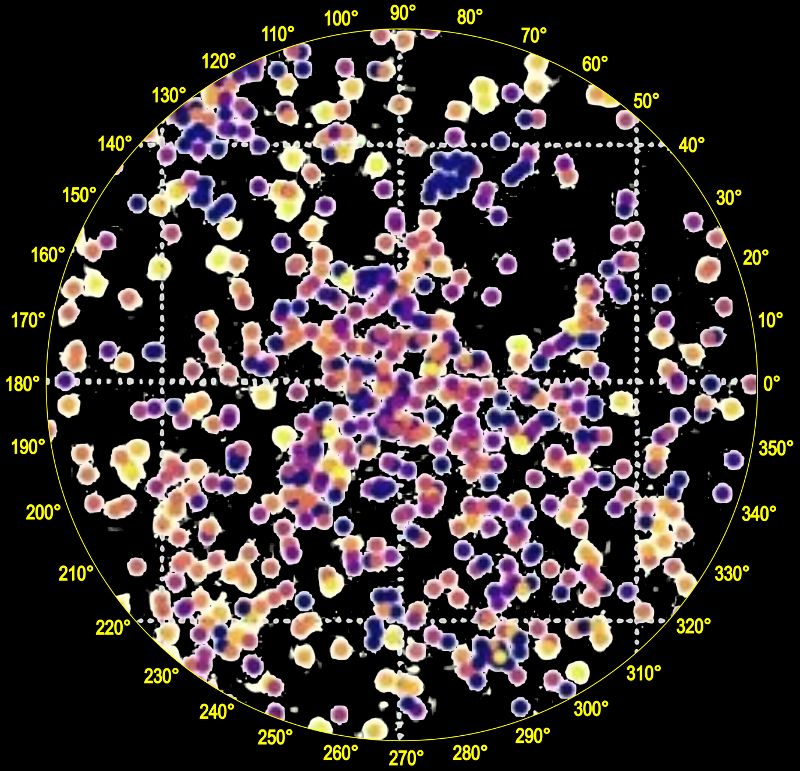
The blue and purple clusters are the youngest clusters. The yellow clusters are cooler clusters more than a billion years old so are not relevant for my hot star map.

All of these maps are consistent with three basic patterns for the ionizing stars within 3000 parsecs:

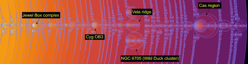
  • The ionizing stars in the Perseus arm are concentrated in the Cassiopeia region between 115-140°. The ionizing stars in the third quadrant (180-270°) are not very concentrated except perhaps in the Vela molecular ridge.
  • The Sagittarius arm is visible in the fourth quadrant (270-360°), especially in the Carina region and to a weaker extent in the first quadrant (0-90°)
  • The Orion spur is visible as an extended diagonal slash between the Perseus and Sagittarius arms.

The full face-on map here also includes two additional features derived from subsets of the ionizing star list: HII regions are positioned on the map as described in this blog post and OB association labels are determined from the median distance to the star members as given in the 1984 Humphreys catalog, with the exception of the Cyg OB7 label, which I moved closer to the position of the Sh 2-117 HII region. The Cyg OB7 stars as listed in the Humphreys catalog were very widely distributed in Gaia DR2, leaving no clear position, but Cyg OB7 is often associated with this HII region, which includes the Pelican and North America nebulae.

There were also a small number of OB association labels from the Humphreys list that were positioned near no obvious star concentration or isosurface region (such as R 103 and R 105) and I removed those from the map. You can see these in the pdf linked from this blog post.

Finally, the full map includes dust concentrations within 2000 parsecs using the data cube provided at the download link on this page:

http://stilism.obspm.fr/about

which is described in this preprint:

"3D maps of interstellar dust in the Local Arm: using Gaia, 2MASS and APOGEE-DR14" by Lallement et al.

Next week, in the last blog post in this series, I'll provide links to star lists, meshes, source code and other resources for the galaxy map.

Making a galaxy map, Part 4: Enclosure

Submitted by Kevin Jardine on 21 June, 2018 - 08:08
Foggy mountain range
Finding structure in Gaia DR2 is like mapping foggy terrain. We may not know exactly how high the peaks go but we can find the mountain ranges nonetheless.

As I mentioned in my last blog post, because of strong dust extinction and reddening in some regions within 3000 parsecs as well as data selection effects and perhaps instrument magnitude limits, two regions that in reality may have similar hot star density may have very different density values in Gaia DR2. In this blog post I describe a technique using structural enclosure analysis for mapping star concentrations using density isosurfaces in the absence of precise density values.

To explain the enclosure technique I'll first step back a dimension and look at how we can analyze structure in contour lines on a topographic elevation map.

Consider the topographic map on the left side of this image:

If we are only interested in the structure of the region, we can remove the contour lines within individual peaks to get the simplified map on the right side.

We can represent the structure of this map using a tree diagram:

which just tells us that there are four peaks, one of which has two subpeaks. The tree diagram removes all the shape, size and location data but reveals the basic map structure.

It turns out that trees can represent any kind of enclosure, regardless of dimension. So they can be used to represent the enclosure structure of hot star density isosurfaces as well.

Another way to represent a tree is through enclosed circles. This circle diagram represents exactly the same tree. This diagram also has no location, shape or size data, but can be a clearer way to represent a complex tree:

The wonderful D3.js JavaScript library has a system to display any tree as a set of enclosed circles, so on this site I've put a circle enclosure diagram for the entire set of connected hot star isosurface regions with a density of 5% or more and with each region containing 5 or more stars (click to view the entire diagram in a separate window):

The background colour represents the star density and the circle size represents (very roughly) the number of stars it contains. Hovering your mouse over a region (when displayed on its separate page) gives the name of the region and a star count. The name of the region consists of the two numbers separated by a dash. The first number gives the density mesh the region is found in and the second number gives a sequential number for the connected regions found in the mesh.

This enclosure diagram is a detailed guide to the structures contained inside the 3D print I showed at the top of my previous blog post.

It turns out that the isosurface regions have some unusual enclosure properties that we can exploit to create our map.

Before I describe those, I think it would be helpful to view some annotated details of the above image:

On the left side:

On the right side:

We can immediately see density problems in these images. For example, the left image implies that there are more hot stars in the nearby southern stars surrounding the Sco OB2 and Vel OB2 associations in the solar neighbourhood than in the Carina region, one of the largest star formation regions known in the Milky Way. Clearly this is not true - it is an artifact of the star selection process, most likely caused by dust reddening, the restriction to very low error parallaxes, or perhaps instrument magnitude limits.

For this reason, a star map based purely on Gaia DR2 star density values would be highly misleading. Fortunately, a careful examination of the enclosure diagram suggests an alternative approach.

We can see that the density distribution is found in three distinct kinds of regions. First, except for a dense concentration in the solar neighbourhood, all the isosurface meshes contain one large region (which I call a plateau) and numerous smaller denser regions (which I call ranges after mountain ranges). The remaining regions occur as density peaks within the ranges.

The plateaus, being large enclosing structures, do not provide the kind of detailed site specific information that the ranges and peaks do, so I excluded them from the map. Looking at the list of ranges greatly simplified the mapping process - although there are about 33 thousand connected regions with a density of 5% or more, there are only about 6 thousand ranges. So this was more than an 80% reduction in the regions that needed to be considered for the map. Most of the connected regions turned out to be peaks contained within these 6 thousand ranges.

6 thousand ranges would still create too much clutter for a map. Without being able to use density, I needed an alternative criteria to select the most important ranges.

I decided to select ranges based on the number of ionizing stars they contained. Well, not exactly - what I actually did was to count the number of stars with a Gaia DR2 colour index less than -0.2. According to Eric Mamajek's very useful stellar colour table, the O-B3 ionizing stars have colour indices lower than this limit in the standard B-V colour system.

It actually seems unlikely to me that the Gaia DR2 colours are precise enough for a specific limit to select ionizing stars, but as you will see in the next blog post, I used an independent list of known ionizing stars as a sanity check for the map.

After some experiments, I split the ranges into three groups: the very ionizing ranges that contained 10 or more stars with ionizing colours, the some ionizing ranges that contained 4 to 9 stars with ionizing colours, and the rest with less than 4 stars with ionizing colours.

I then split the ranges with few or no stars with ionizing colours into three groups based on the total number of hot stars they contained: those with 50 or more, those with 25 to 49 stars, and those with less than 25 stars.

As the last group of ranges with less than 25 stars consisted of many small star clumps that tended to clutter up the map, I did not use those, much as a map of a continent does not attempt to show every town or village.

I also left the set of non-ionizing ranges with 25 to 49 hot stars off the face-on map poster, but it is available as a separate download for Gaia Sky.

For each set of ranges, I also created a set of peaks. After some experimenting, I selected the peaks inside each range with 50 or fewer hot stars. This made it possible to render translucent ranges containing several smaller denser peaks.

I will provide links to the four mesh sets (each containing one range file and one peak file) next week as part of the last blog post in this series.

Making a galaxy map, Part 3: Meshing

Submitted by Kevin Jardine on 20 June, 2018 - 07:46
5% density isosurface
A 3D print of the largest connected region in the 5% mesh.

A mesher takes scalar field slices (such as described in my previous blog post) and a scalar value v and outputs an isosurface mesh such that the surface has value v everywhere, typically using the Marching Cubes algorithm. In this case, these are isosurfaces of constant density.

I used the SliceCubes() function in the Python version of the VTK library to convert the slices to meshes using the VTK implementation of the Marching Cubes algorithm.

I computed a mesh for each density value from 0.99 (99%) to .05 (5%) in 0.01 (1 percent) increments, or 95 meshes in all. The lowest density value of 0.05 (5%) corresponds to 3.33 x 10**(-4) stars per 3x3x3 bin.

I kept a list of the stars contained in each connected region (for future data mining) and output each connected region containing 5 or more stars as a separate mesh.

A typical density mesh may contain hundreds of connected regions. For all the density levels combined, there were 33239 connected regions.

The largest connected region in the 5% density mesh contains 297498 stars, which is 97% of all the stars in the 5% density mesh and 88% of all the stars in the cylinder being mapped. I made a 3D print of this region (displayed in the picture at the top of this blog post).

All of the regions in the galaxy map are inside the 5% density mesh and hence essentially all are inside the 3D print shown above.

But how to choose which of the more than 33 thousand regions to include in the map?

The regions are nested in the sense that all the regions with a density value v1 are contained in regions with density value v2 if v1 > v2.

Medical render
A medical render with two translucent density levels.

Typically, for example, in MRI scans, this density difference (for example between bone and other tissue) is used to render a meaningful display by selecting all the regions from a small range of density values (perhaps 2 to 4) and displaying them using nested translucent meshes.

Indeed I used a similar technique to display TGAS regions from Gaia DR1.

But now we reach the fundamental problem with mapping star distribution using density isosurfaces in Gaia DR2. With medical applications such as MRI scans or in regions of low extinction such as the solar neighbourhood, the density values are well defined. This is not the case for Gaia DR2. Because of dust reddening, instrument magnitude limits and other selection effects, two regions that in reality may have similar star density may have very different density values in Gaia DR2.

How do we map star concentrations using density isosurfaces when the real density values are uncertain?

In my next blog post I will describe how I solved this problem and present what I believe is a new technique for mapping density isosurface regions in the presence of density uncertainty.

Making a galaxy map, Part 2: Slicing

Submitted by Kevin Jardine on 19 June, 2018 - 07:57
Hot star density slice near the galactic plane
An example hot star density slice (in this case near the galactic plane).

In order to apply the isosurface mapping technique, we must convert a point cloud, such as the set of about 340 thousand hot O, B and early A class stars I described in my last blog post, into a scalar field, a real valued function defined in principle for every point in euclidean space (or at least in a defined grid). This scalar field is in some way a measure of star density. We can then extract isosurfaces of constant density from this scalar field, much as contour lines are lines of constant elevation on a topographic map of mountainous terrain on Earth.

In order to make the necessary calculations manageable on my 16 Gb workstation, I placed the density values into 3x3x3 parsec bins.

I represented the cylinder mentioned in my last blog post (with a radius of 3000 parsecs and height 600 parsecs above and below the galactic plane) as a subset of a 6000 x 6000 x 1200 pc box and reduced this into 2000 x 2000 x 400 bins (with dimensions 3x3x3 pc) in a numpy array.

I then counted the number of stars in each bin. This created a scalar field of sorts, but a very discontinuous one.

I borrowed the gaussian smoothing technique mentioned in H. Bouy and J. Alves 2015, "Cosmography of OB stars in the Solar neighbourhood". For the map I chose a a gaussian sigma of 15 parsecs. The choice of a gaussian sigma is as much an aesthetic choice as it is a scientific one. The higher the sigma, the less detailed the map. A low sigma results in a chaotic map. A high sigma results in a smooth map with limited detail. I experimented with several values before settling on 15 parsecs.

Fortunately, the Python library scipy.ndimage.filters has an appropriate gaussian_filter function that could be applied directly to the numpy array.

In addition, for ease in future processing, I wanted to ensure that the values of the density function ran between 0 and 1.

There are numerous ways to normalize the density values in this way (for example dividing by the maximum value). The option I chose is to use this variation of the sigmoidal logistic function:

f(x) = 2/(1+exp(-kx)) - 1

which ranges between 0 and 1 in an S-shaped curve as x ranges between 0 and infinity.

This sigmoidal value stretching / normalization is often used in image processing to continuously compress data with very high and low values into a smoother middle range. As with the gaussian sigma value, the logistic k value is partly an aesthetic choice. A low k value pushes the function towards 0. A high value pushes the function towards 1. After experimenting with various values for k, I selected 300. This seemed to more evenly spread the possible density values between 0 and 1.

The scipy.special library has an expit function that can be applied to numpy arrays.

I then sliced the cylinder values in the numpy box from top to bottom in 3 pc slices and output the results as coloured 8 bit images (for debugging the sigma and k values) and as 16 bit pgm values (needed for isosurface generation). One of the coloured slice images is at the top of this blog post.

Once the slices were done, I could move on to the next stage: meshing.

Making a galaxy map, Part 1: Data

Submitted by Kevin Jardine on 18 June, 2018 - 08:15
ESA Gaia ADQL advanced search
The public archive site can be used to download Gaia DR2 data.

Last week I released a map of the Milky Way within 3000 parsecs (10 thousand light years) of the Sun made using data from Gaia DR2 and several other sources as described on my previous blog post.

You can see a face-on web version here or view the full 3D meshes in the latest version of Gaia Sky.

This week I'm starting a series of blog posts to explain in detail how I created the map. I hope that these posts will be useful for others who might want to try the density isosurface technique to create their own maps. At the end of this series I'll link to relevant resources, including the map meshes, SVG and Blender files, and Python source code.

The Gaia DR2 archive provides parallaxes for more than a billion stars, but I used only a tiny fraction of these to create the actual map. First, I selected only the stars with the most accurate parallaxes in the Gaia DR2 data set, the 72 million stars with error/parallax < 0.1.

There is a field in the Gaia DR2 database that is the reciprocal of this value, parallax_over_error. So in practice I was selecting the stars with parallax_over_error > 10.

The main difficulty with extracting this data set from the Gaia archive was the time. For the main archive, there is a maximum query limit of 30 minutes and at the time I was using the archive, selecting the data was slow. I ended up splitting the data selection into 28 queries based on the parallax value. A sample query is shown in the image at the top of this blog post. It took most of a day to get all the data. I do wonder if the Gaia database administrators might consider allowing faster downloads for commonly used data subsets.

After acquiring the data, I applied a few quality cuts and selected only about 400 thousand very hot O, B and early A class stars using a colour index filter with colour index < 0 and added an absolute magnitude cut (absolute magnitude < 7) to filter out dim but hot non-main sequence stars like white dwarfs. (Actually the hot stars I was mapping all have an absolute magnitude much brighter than 7. I chose that number to compensate for some dust extinction as well.)

The Gaia DR2 database includes a raw colour index value bp_rp, and a second colour excess value, e_bp_min_rp_val, that attempts to correct for dust reddening.

So we can define colour index = bp_rp - e_bp_min_rp_val.

These values are a relatively simple estimate of what Gaia will ultimately be capable of - more accurate colour values will be provided in Gaia DR3.

Filtering to these hot, young stars was an essential part of making the map possible. Cooler, older stars tend to drift randomly from their sites of formation. I tried a number of experiments to map cooler stars without a great deal of success - they were either present in a large number of random clumps or, at lower density levels, just a few large areas.

In contrast, hot young stars are largely gathered in dense associations, mostly near the galactic plane. Their distribution, especially those regions containing the ultra hot O-B3 class ionizing stars, form a distinct (and hence mappable) pattern.

After the colour selection, I further filtered to all stars within a cylinder with a radius of 3000 parsecs and a height of 600 parsecs above and below the galactic plane.

Why the 3 kpc limit? The main reason is that stars with very accurate parallaxes (err/plx < 0.1) start to fade out beyond 3.6 kpc. I definitely wanted to include the Carina nebula, which is more than 2 kpc away. The further I extended the map, the less accurate the star positions became, and also, more pragmatically: most of the structures (eg. OB associations or HII regions) that astronomers have named turn out to lie within 3 kpc. So a 3 kpc limit allowed the most accurate map with names for most of the major regions.

The 600 parsec height limit was a bit arbitrary and was mostly to reduce memory consumption. This did result in some truncation for a few very low density regions. An interesting alternative map might ignore the thin disk and look for density structures in the thick disk and halo.

This distance cut gave me a final data set of about 340 thousand stars, ready for the next stage of density isosurface generation - slicing.

Pages

Subscribe to Galaxy Map RSS