
Finding structure in Gaia DR2 is like mapping foggy terrain. We may not know exactly how high the peaks go but we can find the mountain ranges nonetheless.
As I mentioned in my last blog post, because of strong dust extinction and reddening in some regions within 3000 parsecs as well as data selection effects and perhaps instrument magnitude limits, two regions that in reality may have similar hot star density may have very different density values in Gaia DR2. In this blog post I describe a technique using structural enclosure analysis for mapping star concentrations using density isosurfaces in the absence of precise density values.
To explain the enclosure technique I'll first step back a dimension and look at how we can analyze structure in contour lines on a topographic elevation map.
Consider the topographic map on the left side of this image:
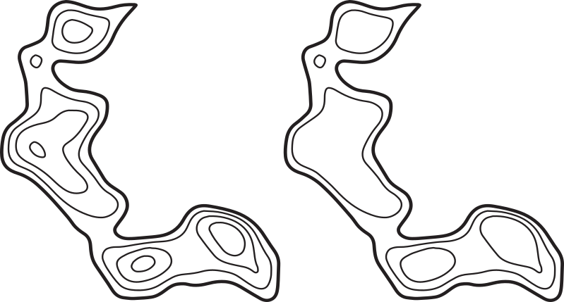
If we are only interested in the structure of the region, we can remove the contour lines within individual peaks to get the simplified map on the right side.
We can represent the structure of this map using a tree diagram:
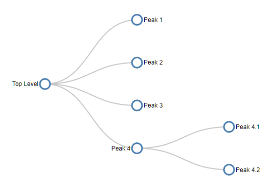
which just tells us that there are four peaks, one of which has two subpeaks. The tree diagram removes all the shape, size and location data but reveals the basic map structure.
It turns out that trees can represent any kind of enclosure, regardless of dimension. So they can be used to represent the enclosure structure of hot star density isosurfaces as well.
Another way to represent a tree is through enclosed circles. This circle diagram represents exactly the same tree. This diagram also has no location, shape or size data, but can be a clearer way to represent a complex tree:

The wonderful D3.js JavaScript library has a system to display any tree as a set of enclosed circles, so on this site I've put a circle enclosure diagram for the entire set of connected hot star isosurface regions with a density of 5% or more and with each region containing 5 or more stars (click to view the entire diagram in a separate window):
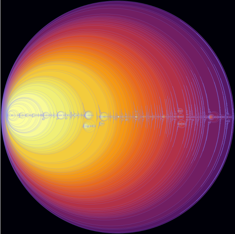
The background colour represents the star density and the circle size represents (very roughly) the number of stars it contains. Hovering your mouse over a region (when displayed on its separate page) gives the name of the region and a star count. The name of the region consists of the two numbers separated by a dash. The first number gives the density mesh the region is found in and the second number gives a sequential number for the connected regions found in the mesh.
This enclosure diagram is a detailed guide to the structures contained inside the 3D print I showed at the top of my previous blog post.
It turns out that the isosurface regions have some unusual enclosure properties that we can exploit to create our map.
Before I describe those, I think it would be helpful to view some annotated details of the above image:
On the left side: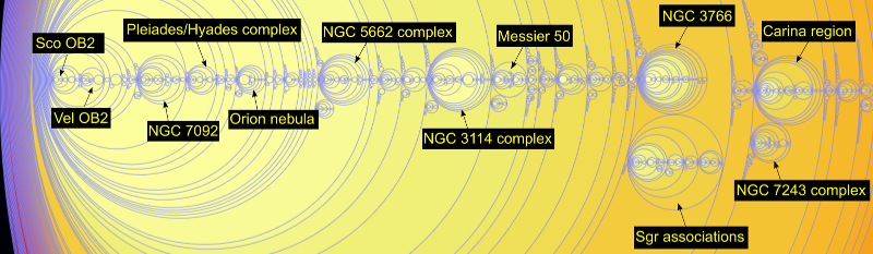
On the right side: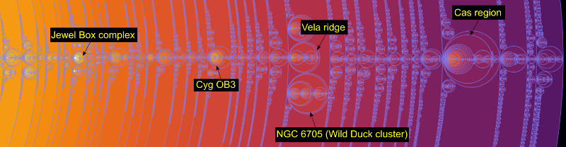
We can immediately see density problems in these images. For example, the left image implies that there are more hot stars in the nearby southern stars surrounding the Sco OB2 and Vel OB2 associations in the solar neighbourhood than in the Carina region, one of the largest star formation regions known in the Milky Way. Clearly this is not true - it is an artifact of the star selection process, most likely caused by dust reddening, the restriction to very low error parallaxes, or perhaps instrument magnitude limits.
For this reason, a star map based purely on Gaia DR2 star density values would be highly misleading. Fortunately, a careful examination of the enclosure diagram suggests an alternative approach.
We can see that the density distribution is found in three distinct kinds of regions. First, except for a dense concentration in the solar neighbourhood, all the isosurface meshes contain one large region (which I call a plateau) and numerous smaller denser regions (which I call ranges after mountain ranges). The remaining regions occur as density peaks within the ranges.
The plateaus, being large enclosing structures, do not provide the kind of detailed site specific information that the ranges and peaks do, so I excluded them from the map. Looking at the list of ranges greatly simplified the mapping process - although there are about 33 thousand connected regions with a density of 5% or more, there are only about 6 thousand ranges. So this was more than an 80% reduction in the regions that needed to be considered for the map. Most of the connected regions turned out to be peaks contained within these 6 thousand ranges.
6 thousand ranges would still create too much clutter for a map. Without being able to use density, I needed an alternative criteria to select the most important ranges.
I decided to select ranges based on the number of ionizing stars they contained. Well, not exactly - what I actually did was to count the number of stars with a Gaia DR2 colour index less than -0.2. According to Eric Mamajek's very useful stellar colour table, the O-B3 ionizing stars have colour indices lower than this limit in the standard B-V colour system.
It actually seems unlikely to me that the Gaia DR2 colours are precise enough for a specific limit to select ionizing stars, but as you will see in the next blog post, I used an independent list of known ionizing stars as a sanity check for the map.
After some experiments, I split the ranges into three groups: the very ionizing ranges that contained 10 or more stars with ionizing colours, the some ionizing ranges that contained 4 to 9 stars with ionizing colours, and the rest with less than 4 stars with ionizing colours.
I then split the ranges with few or no stars with ionizing colours into three groups based on the total number of hot stars they contained: those with 50 or more, those with 25 to 49 stars, and those with less than 25 stars.
As the last group of ranges with less than 25 stars consisted of many small star clumps that tended to clutter up the map, I did not use those, much as a map of a continent does not attempt to show every town or village.
I also left the set of non-ionizing ranges with 25 to 49 hot stars off the face-on map poster, but it is available as a separate download for Gaia Sky.
For each set of ranges, I also created a set of peaks. After some experimenting, I selected the peaks inside each range with 50 or fewer hot stars. This made it possible to render translucent ranges containing several smaller denser peaks.
I will provide links to the four mesh sets (each containing one range file and one peak file) next week as part of the last blog post in this series.