
Flocks of birds, schools of fish and concentrations of stars can all be mapped using isosurfaces.
The TGAS (Tycho-Gaia Astrometric Solution) data set released as part of Gaia DR1 in September 2016 contains positions and parallaxes for 2057050 stars, about 85% of the 2432906 stars in the Tycho-2 catalog. This is the first time that parallaxes (and hence distance estimates) have been available for such a large number of stars.
Nevertheless, TGAS contains a tiny fraction of the hundreds of millions of star parallaxes that will be released as part of Gaia DR2, currently scheduled for April 2018.
How can we construct a map from such an enormous amount of information?
Isosurfaces
We know already that stars are not distributed randomly but are found in vast concentrations, much like flocks of birds or schools of fish on Earth. These concentrations range in scale from systems with multiple stars, clusters, and associations all the way up to spiral arms. There is structure at every scale. One important tool to map this stellar distribution is isosurfaces of constant star density.

Isosurfaces are the three-dimensional equivalent of the isolines on a topographic elevation map.

Isosurfaces fit inside each other like complex Russian nesting dolls.
An algorithm for converting the point set of a scalar field with a given value into a surface mesh was invented by William E. Lorensen and Harvey E. Cline and published in 1987. The marching cubes algorithm is most often used to convert MRI scans into images of tissues and bones for medical diagnosis and research. It has many other uses for scalar fields, including the analysis of stellar distribution.
We can think of the isosurfaces generated by the marching cubes algorithm as the three dimensional equivalent of the isolines used in topographic maps to show lines of constant elevation. In an elevation map, lines representing higher elevation appear inside lines representing lower elevation. The sequence of isolines of increasing elevation define a mountain peak. Similarly, a sequence of isosurfaces representing increasing star density represents a "star peak".
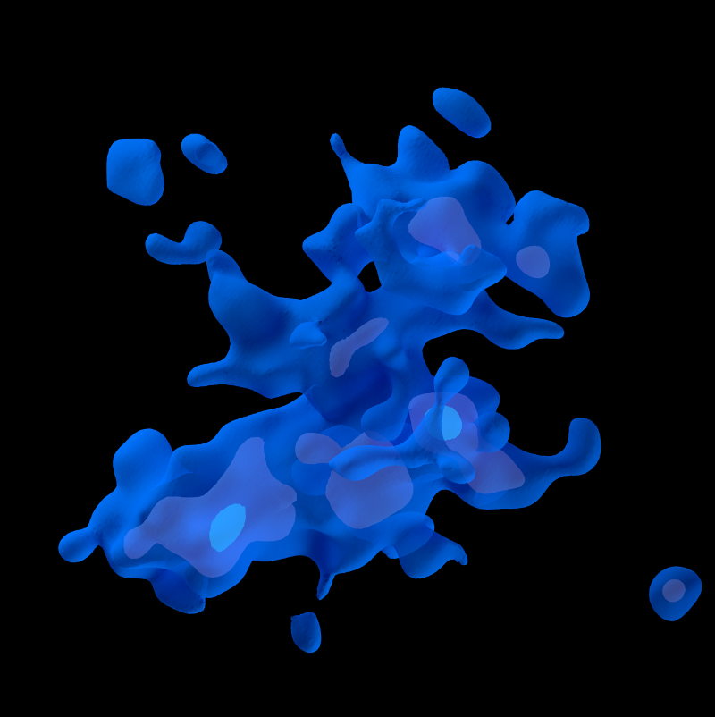
One difficulty in visualizing isosurfaces is that they are three-dimensional structures and representing a sequence of isosurfaces enclosing each other is often confusing and difficult to interpret - a bit like a series of very complex Russian nesting dolls. We can use translucent surfaces to represent a few enclosed surfaces as in this image:
However, for a larger sequence of isosurfaces, an animation that shows less dense isosurfaces fading or evaporating to reveal denser surfaces inside is often clearer.
Star selection
Converting the Gaia parallax data into density isosurfaces is straightforward. First I select the most accurate parallax data with error/parallax < 0.2. There are about a million stars in the TGAS data set with this parallax accuracy. A second step is required because simply computing density surfaces of this data set does not give a map of the solar neighbourhood! Instead it returns a sequence of nested ellipsoids. This is because an unfiltered analysis is limited by what Gaia can see and Gaia sees more stars at shorter distances than further away. What we need to do to produce a map is to select stars that Gaia can see out to a reasonable distance of 600-800 parsecs. So we need intrinsically bright stars to construct a map.
After some experimenting, I found two TGAS subsets of the low error stars that generate reasonable maps. The first is the 400 thousand "bright" stars with absolute magnitude <= 3 (remember that the brighter the star, the lower the magnitude value). The second is the 20 thousand "hot" stars with colour index <= 0. Except for some very dim but hot white dwarfs close to the Sun, the hot stars are essentially a subset of the bright stars in the TGAS data set.
For each of these "bright" and "hot" star sets, I convert the parallax and positions into (x,y,z) coordinates and then count the stars in each 2x2x2 parsec bin.
In order to produce reasonably smooth isosurfaces, I then used a gaussian smoothing function (usually with a sigma of 15 parsecs) to produce a scalar field defined within a cube with a radius of 800 parsecs from the Sun. The scalar density field can then be converted into isosurface meshes using the marching cubes algorithm mentioned above.
You can see an animation showing the lower density bright isosurfaces fading into higher density surfaces below. The bright star isosurfaces dissolve from the low density 20% isosurface by 5% increments until they reach the high density 95% bright star isosurface. (The percentages used to define isosurfaces are always a percentage of the maximum density found in the data set. So a 40% isosurface contains all the stars with a density that is 40% or more of the maximum value.)
In this animation, the Sun is at the centre and the direction to the galactic nucleus (0° galactic longitude) is at the top.
A similar animation for hot isosurfaces is here:
Bright versus hot stars
Because the hot stars are essentially a subset of the bright stars, it is tempting to think that the regions within the bright star isosurfaces always contain a hot star core, much like human tissue is supported by a bony skeleton, but this is not the case! There are significant bright star concentrations that contain no hot star cores.
As I explained in my previous blog post, the dense hot star concentrations within the TGAS data are found largely within three major regions, or stellar continents. The bright stars, on the other hand, form a ring around the local bubble. As a result, there are large concentrations of bright stars found between the hot star continents, especially in the hot star gaps I've nicknamed the Strait of Centaurus and the Gulf of Auriga.
I've created a few animations to make the differences between the bright star and hot star concentrations clearer.
The first example shows the above bright star dissolve animation (this time in green) and within this dissolve, I have included the 40% hot star isosurface (in blue). You can see how the blue hot star isosurface is embedded within the green bright star isosurfaces, but also how there are bright stars located where there is no hot star core.
Here is a similar example, except that this time the bright star dissolve reveals the 50% hot star isosurface:
And the 60% hot star isosurface:
And the 70% hot star isosurface:
The difference between the distribution of the hot and bright stars tells us that mapping stars in the galaxy is not as straightforward as mapping land on the Earth. Depending upon the stars we select, many maps are possible.