You are here

Blogs

Panurania

Submitted by Kevin Jardine on 12 December, 2016 - 10:31

In my last blog post, I showed 3D slices of a TGAS density function that reveal the concentrations of high temperature stars. There is a very clever algorithm called the marching cubes algorithm that can take such 3D slices and convert them into 3D surface meshes that can be rendered in a 3D graphics program. In my case I used the vtkSliceCubes function in a Python port of the amazing VTK graphics library to generate the meshes and then rendered the resulting meshes in the Blender 3D program.

I'll be presenting some of these Blender images over the next few blog posts.

It is important to keep in mind that TGAS is missing many stars (especially high temperature stars) in the solar neighbourhood and the maps we generate using it will inevitably be incomplete. We can look forward to more complete maps a year from now with the release of Gaia DR2.

The marching cubes algorithm takes a function f on 3D points and a number v and generates isosurfaces that consist of all points (x,y,z) where f(z,y,z) >= v.

The isosurface typically consists of a number of disconnected pieces.

The value v ranges between a minimum value (usually 0) and a maximum value. At the minimum value, there is always one isosurface piece that contains all the points.

As the value v increases, the isosurface typically fragments into more and smaller pieces, until v reaches its maximum value when the isosurface may be empty or consists of a few small pieces around points that take on the maximum value.

The TGAS isosurfaces follow a similar pattern with the density function that I described in my previous blog posts, but what is interesting is what happens to the isosurface when v ranges between its maximum and minimum value.

Here is a table showing information about the isosurfaces as the TGAS temperature density v ranges between 5% and 95% of its maximum value.

density stars star percentage regions with 90% stars stars in 90% regions
5% 19305 95.27% 1 18778
10% 18241 90.02% 1 17655
15% 16182 79.86% 1 15811
20% 14480 71.46% 1 14071
25% 12712 62.74% 1 12249
30% 10945 54.01% 1 10485
35% 9264 45.72% 1 8769
40% 7819 38.59% 3 7308
45% 6527 32.21% 3 6054
50% 5292 26.12% 3 4834
55% 4183 20.64% 3 3854
60% 3239 15.98% 5 2934
65% 2448 12.08% 8 2225
70% 1747 8.62% 14 1574
75% 1222 6.03% 15 1100
80% 807 3.98% 10 727
85% 486 2.40% 9 439
90% 214 1.06% 9 195
95% 62 0.31% 4 60

The first column is the density value used to generate the isosurfaces. The second column is the number of high temperature stars inside the isosurface. The third column is the percentage of high temperature stars that are inside the isosurface compared to all TGAS high temperature stars. There are 20263 hot stars (color index <= 0) in TGAS with error ratios less than 0.2. So, for example, 95.27% of these 20623 stars are inside the isosurface where the density is greater than or equal to 5%.

The fourth column is the number of isosurface pieces that contain 90% of the isosurface stars.

It is not surprising that almost all the stars are within the 5% isosurface. What is more interesting is what happens as the density value goes up. Even when we reach 35% density, 45.72% of all the hot TGAS stars are still within the isosurface, and more than 90% of these are still within one giant stellar "supercontinent".

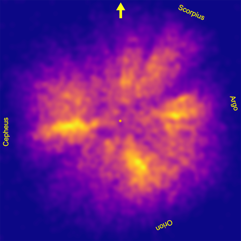
After 35%, the supercontinent breaks into three smaller stellar continents. The three continents are also persistent and only start to break up at 60% density, when the isosurfaces start to fragment into regions of dense hot star concentrations including well known local OB associations such as Ori OB1 and Sco OB2.

Since the stellar supercontinent and three denser continents contained within it are so persistent, this suggests that they are real structures and not just artifacts of the density function.

Earth once had a supercontinent that contained most of its land, called Pangaea. It seems inevitable therefore to call the stellar supercontinent Panurania, after both the goddess Gaea's husband Ouranos/Uranus, the god of the sky, and his great granddaughter Urania, the muse of astronomy.

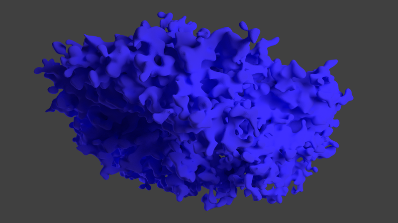
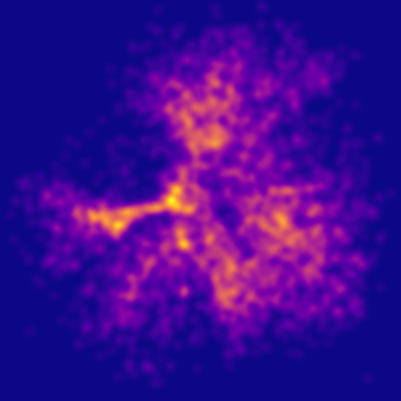
We'll look at Panurania in more detail in the next blog post, but here is a teaser image of the 25% density isosurface rendered in Blender.

You can see that it has a very distinctive shape. We'll look at some possible reasons in the next blog post.

Mapping TGAS - Part 2

Submitted by Kevin Jardine on 2 November, 2016 - 21:59

It is important to keep in mind that I'll really be using the temperature density function T(x,y,z) I mentioned in my last blog post to map the TGAS data, which is not quite the same thing as the stars in the solar neighbourhood.

TGAS looks a little like a donut with a 600 pc radius, a hole around the Sun, and a few large bites taken out of it. It has missing data. I'll discuss this missing data in more detail in a future post. For now, I'll take TGAS as it is.

We can construct a preliminary version of T(x,y,z) quite simply. For any point (x,y,z), round off the values to the integer point (i,j,k). Select all the TGAS stars in the one parsec cube centred on (i,j,k) with err/parallax < 0.2 and the colour index Ci < c where c is some value that appropriately selects hot stars. In my experiments below, I'll look at c = 0.0 and c = 0.1.

Then convert the Ci value for each star to temperature (I did that by interpolating Eric Mamajek's very useful table here). Add up all the temperatures for the stars in the cube. That is T(x,y,z). If there are no stars in the cube, set T(x,y,z) to zero.

This is a temperature density function of sorts but for our purposes it is not a very useful one. For mapping and presentation purposes we need a relatively smooth function that ranges between 0 and 1. What I have defined so far is a very discontinuous and spiky function. Fortunately there are some very common techniques that we can use to tame our function.

The first step is to de-spike the function. In astronomy, a common practice is to apply a de-spiking function to data to reduce it to a more manageable range. De-spiking functions commonly used are sqrt, ln or arcsinh. In my experiments with the TGAS data, I found a fourth root sqrt(sqrt(x)) works very well.

The second step is to smooth the function out over 3-dimensional space. A convenient way to do this is to apply a gaussian normal function. This is in effect a weighted average where the weight gets smaller the farther you are from the point. 2d gaussian smoothing is commonly used to reduce unwanted detail in photographs. 3D gaussian smoothing is similar except that it takes place in all three dimensions. The amount of smoothing is defined by the standard deviation σ (sigma). In the experiments below I look at σ values of 10 and 15 parsecs.

The final step is to clamp the values of the function between 0 and 1. One common clamp function is to just test to see if a value is > 1 and if it is, set it to 1. However, this introduces an ugly discontinuity into our function and we want something smoother. Another option is to find the largest value in our data set and divide all the other values by it. Although this does clamp the function in a continuous way, in many data sets, even after de-spiking, the maximum value can be large and this might create a function with a poor spread in values where only a few values are close to 1 and most other values are close to 0.

At this point I'd like to introduce one of my favourite tools for image processing, the sigmoid function. There are several variations of this, but the one I will use is:

f(x) = 2/(1+exp(-s*x)) - 1

where s is a constant called a spread.

This function uses the constant s to spread the values over a reasonable range and then the function guarantees that the values are smoothly clamped between 0 and 1.

De-spiking, smoothing and clamping are common image processing techniques that work just as well for 3D data sets. In this case, the range of possible temperature density functions is determined by the constants c, σ and s. Getting these constants right is important. Selecting the wrong c might exclude important hot stars or alternatively contaminate the data by introducing cooler stars that have drifted far from their origins. Selecting the wrong σ might remove important details from the data or alternatively fragment the data into too many small regions. Selecting the wrong s spread value might squeeze most of the data into too small a range.

It turns out that it was not that difficult to select reasonable spread values. The other values were more difficult so I tried some experiments with c = 0.0 and 0.1 and σ = 10 and 15.

The results for the galactic plane are below (0° galactic longitude is at the top of the images):

After looking at the various options (including animating full versions of the 3D dataset for all four parameter options) , I chose c = 0.0 and σ = 15. A larger version for the galactic plane using those values is at the top of this blog post.

You can journey through the full TGAS cube using this temperature density function in the animation here:

(best at 4K full screen or at least full screen).

There is a lot to see in this animation but a commentary will have to wait for a future blog post.

Mapping TGAS - Part 1

Submitted by Kevin Jardine on 2 November, 2016 - 18:53

Mapping is all about providing physical context for data. On Earth, the question "Where am I?" is answered on a map by showing the user a set of hierarchical context, including

  • local streets
  • nearby buildings
  • elevation
  • parks and rivers
  • transportation systems

and so on.

A good map of the solar neighbourhood would have its own set of structures:

  • dust clouds
  • regions of ionized gas
  • hydrogen concentrations
  • star formation regions
  • supernova remnants

and so on.

I have placed dust clouds, some ionized gas and a few supernova remnants on the Tycho Galaxy interactive TGAS display.

However, the truth is that Gaia has already made this information outdated and much more accurate information will be available in a few years, especially once Gaia scientists publish a catalog containing the distances and spectral types for a billion stars. For example, by comparing a star's real spectral type with its colour index as seen from Earth, we can determine its reddening and therefore the dust that lies between Earth and that star. With reddening data for a billion stars, astronomers will be able to construct an incredibly detailed 3D map of dust and gas in the solar neighbourhood.

But for some things we don't have to wait.

In principle, the TGAS data in Gaia DR1 already allows us to produce detailed maps of the star formation regions within about 600 parsecs. The key is the location of the hot stars.

Hot stars tend to be young and young stars have not drifted far from the sites where they were born.

We can compute a star's temperature from its colour index. A star's colour index can be determined using the BT and VT magnitudes from the Tycho-2 catalog. Specifically,

Ci = 0.85*(BT - VT)

Usually a hot star is considered to be an O and B class star (Ci < 0) or even only O stars and B stars down to B3 (Ci < -0.18). However, we have to consider that many stars in the Tycho-2 catalog are reddened by dust, and so some hot stars might have a positive colour index.

Once we have the temperatures for the hot stars, we can create a temperature density function, T(x,y,z), that essentially tells us how close any point (x,y,z) in space is to hot stars (and how hot these are). It is this "hotness" function that will help us map the structure of star formation regions.

See Bouy, H., and J. Alves. "Cosmography of OB stars in the solar neighbourhood." Astronomy & Astrophysics 584 (2015): A26 for a similar approach using Hipparcos data.

So how can we create T(x,y,z) and how can we use it to map the solar neighbourhood once we have it? Check my next blog post for many more details.

A Void in TGAS

Submitted by Kevin Jardine on 27 October, 2016 - 19:39

In my last blog post, I drew attention to a hot star concentration that I labelled (or rather mislabelled) "Cepheus" in a temperature density image. Here is the image again:

I called the concentration Cepheus because it appears at about 95° galactic longitude and the constellation Cepheus is located around this longitude above the galactic plane.

However, it turns out that the concentration is created by a thin wall of hot stars located at a distance of -300 < z < -150 parsecs below the galactic plane. Here is a temperature density map restricted to -300 < z < -150 pc:

It looks like the "wall" (the brightest part of this image) is part of a larger complex that forms the boundary of an enormous void in the lower half of the first quadrant. Could it be a bubble?

I did a second height map animation that makes the wall and the "bubble" look quite impressive:


I did a preliminary calculation that shows that the centre of the "bubble" is somewhere in the direction of Aquarius.

Then, this morning, Gaia scientist Ronald Drimmel sent out this tweet with his latest TGAS completeness image:

The biggest gap is ... somewhere in the direction of Aquarius.

So there is a void in TGAS in the lower first quadrant, but in the data, not in space! Gaia had simply not scanned that part of the sky much yet when the first data release was prepared and TGAS is missing most stars in that direction.

The wall around the void appears simply because there are two nearby gaps in the TGAS data below the galactic plane and the "wall" is the narrow region in between.

I have been thinking of TGAS as a donut that starts to fade out around 600 pc with a hole around the Sun caused by a lack of bright (as seen from Earth) and high proper motion stars. And to a first approximation it is - but a donut with a few bites taken out of it.

The Mountains of Tycho

Submitted by Kevin Jardine on 26 October, 2016 - 09:50

Suppose that you wanted to make a map of Europe and all you had was a satellite image taken at night. You might start with something like the image below.

If you did a careful analysis of the distribution of the lights, you could extract quite a bit of information from this image, including the location of major cities and most of the coast line.

We have a similar situation with the TGAS data set. The distribution of the stars, especially the hotter stars, is by no means random. Using some mathematical tools, we can extract quite a bit of information about the solar neighbourhood out to about 800 parsecs (beyond this distance, the limited accuracy of the parallax measurements for even the brightest stars makes them impossible to place on a map).

One key tool is temperature density. The Tycho-2 catalog provides B and V magnitudes for almost all the stars. The difference B-V is called the colour index and it can be used to estimate the temperature of a star.

We are more likely to find structures to map using the hotter stars because these tend to be younger and younger stars are located close to the star formation regions within which they were born. (We can think of a star formation region as analogous to a city in a map of Earth.) Older, cooler stars often drift in random directions from their origin over time and so are less useful for mapping purposes.

Astronomers usually use the hottest O and B class stars to map star formation regions. These correspond to B - V < 0. However, I've been a bit more generous in my analysis because stars embedded in dust clouds can be reddened, increasing their colour index. So I've selected all the Tycho-2 stars with B-V < 0.1 to include some of the reddened B-class stars. In some cases this pulls in some hotter A-class stars but that should make little difference for the analysis.

I've interpolated Eric Mamajek's very useful table to convert colour index to effective temperature.

As usual, I am starting with the approximately 1 million stars in the TGAS data set with err/parallax < 0.2 for the reasons explained in my previous blog post on TGAS limitations.

In order to find structures, you have to have a way to aggregate individual star data. I've done this in two steps:

  • Bin the data
  • Smooth the data

In my first experiment, I calculated the x, y and z values in parsecs relative to the Sun. I defined my bins as all the stars with the same integer x and y values. For this first experiment, I ignored the z value, so this adds together all the stars with the same x and y parsec values above and below the galactic plane regardless of their z-height. I then added together the temperatures for all the stars in each bin with B-V < 0.1.

To smooth the data, I started by taking the square roots of the temperature sums to reduce the spikiness of regions with a lot of hot stars. I then used gaussian smoothing with a sigma (standard deviation) of 15 parsecs. The result of my first experiment is below. I have added the position of the sun at the centre, an arrow pointing in the direction of the galactic nucleus, and names for each of the four identified hot star concentrations. The full image (right to the edge of the rectangle) is 800x800 pc. You can see that the hot star density drops well before 800 pc.

It is much easier to visualise these density distributions as height maps, so I created and animated one in the 3D graphics application Blender. You can see the result on Youtube:

(I suggest going to full screen and right-clicking on the video to set the loop option as the animation is fairly fast.)

There are some surprising structures visible in these images, especially in the hot star concentration that I labelled Cepheus. I'll discuss some of them in my next blog post.

Pages

Subscribe to RSS - blogs