You are here

Blogs

Next steps on TGAS mapping

Submitted by Kevin Jardine on 22 July, 2017 - 13:17
Enclosure diagram
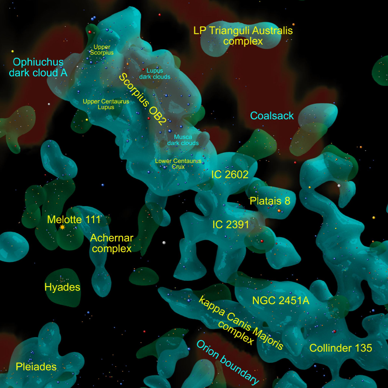
A detail of the 40% density isosurface from the solar neighbourhood map.

Now that version 3 of the solar neighbourhood map is out, I am thinking about next steps.

Gaia DR2, expected in April 2018, will allow for more detailed, more accurate and much larger maps, but in the nine months or so we are waiting for it, there are quite a few things that I could do. Here are some possibilities. I would welcome your suggestions or feedback as well.

  • Create a 15-20 minute "Welcome to the Neighbourhood" video on Youtube including 3D animations made from the map meshes.
  • Design a board or video game played on a real map of the solar neighbourhood.
  • Create a larger map. I pushed the data about as far as I dared within reasonable error limits but there is a paper that uses models of star distribution to relax the error conditions somewhat. If I extended the map from its current radius of 650 pc to 1000 pc, I could include some larger star associations in the direction of Cepheus.

You can email me at kevinjardine@gmail.com or DM me at @galaxy_map on Twitter.

The structure of the solar neighbourhood

Submitted by Kevin Jardine on 21 July, 2017 - 00:45
Enclosure diagram
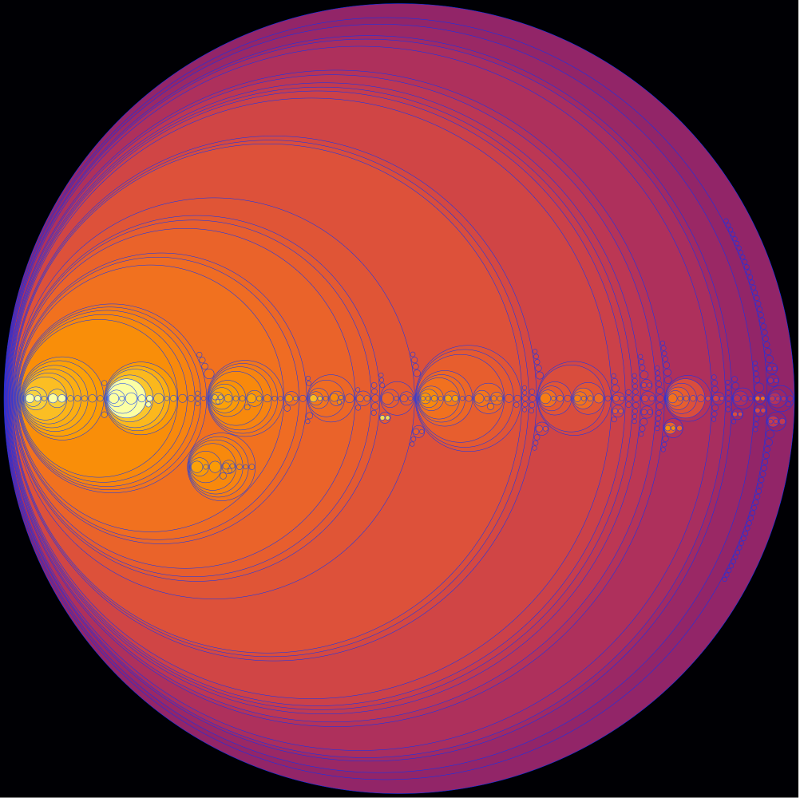
An enclosure diagram showing the 419 OB star density peaks with 5 or more stars in the solar neighbourhood (within 650 pc or 2100 ly).

Sometimes less is more. The above image is an enclosure diagram showing the star density peaks in the solar neighbourhood and how they are contained within each other.

It was constructed by computing the OB star density isosurfaces for each integer value from 10% to 99% and maintaining a list of stars contained by each connected subregion.

An enclosure diagram lacks position or shape data, but reveals the star distribution and structure in a clear way. The circle size represents the number of stars in the region and the colour intensity the density.

Using the large version of the enclosure diagram here you can hover over each component to see its region label, name, and the number of stars it contains.

The names are based on clusters, associations or the brightest star contained by the region.

You can see that the solar neighbourhood contains four major dense OB star concentrations: Scorpius OB2, Vela OB2, the Orion Belt (Orion OB1) and the Perseus / Taurus dark cloud concentration that includes the Pleiades and the Perseus OB3 association. Less dense but still large concentrations include the three northern regions (ASCC 123, Cepheus OB6, and the Sulafat highway) as well as the Wishing Well region named after its core Wishing Well cluster (NGC 3532).

In April 2018, Gaia DR2 will be released with distances to more than a billion stars. Density isosurfaces and enclosure diagrams will have key roles to play in mapping this dataset and identifying the major regions within it.

Version 3 of the solar neighbourhood map

Submitted by Kevin Jardine on 20 July, 2017 - 01:34
Orion region
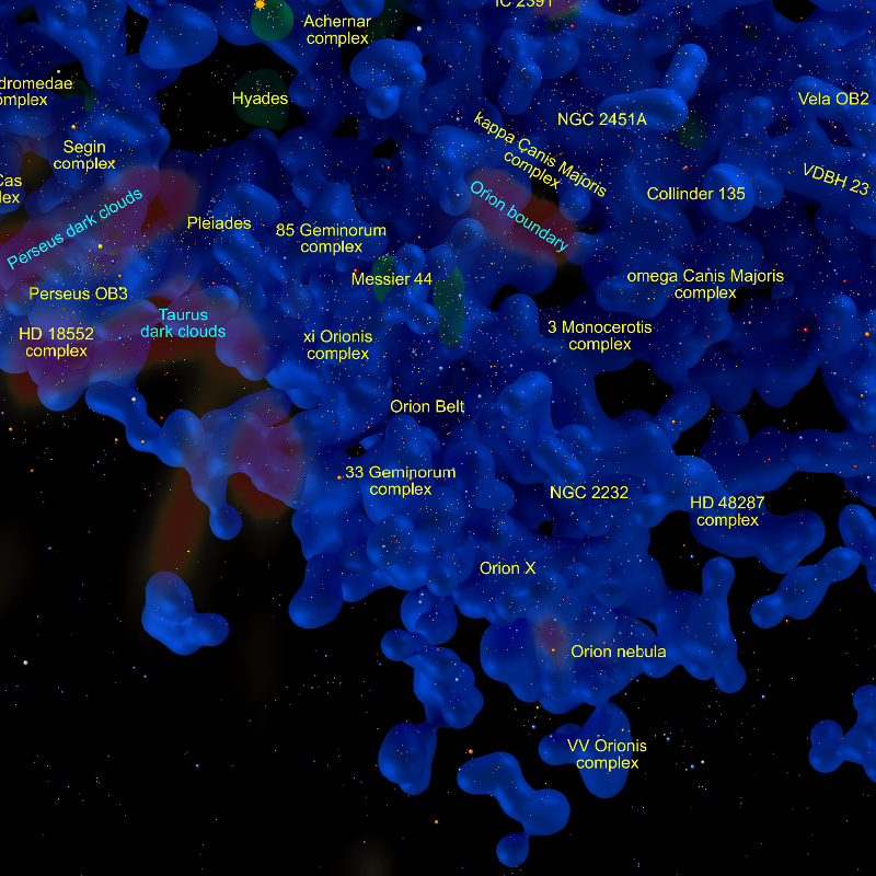
A detail of the 18% isosurface around Orion taken from the third version of the solar neighbourhood map. Oriented so that the direction to the galactic centre is at the top.

As I mentioned in my previous blog post, I have created a new version (v. 3) of the solar neighbourhood map. This uses colours taken from the 2MASS catalog and has simpler controls (dust is always turned on and the views always show a 70% bright star isosurface). You can select several different hot star isosurface densities as well as three different label schemes.

The brightest stars now have labels if you select the isosurface or stars label options.

The new dust overlay is taken from figure 3 (top) in this preprint:

Three-dimensional mapping of the local interstellar medium with composite data,
Capitanio, Letizia; Lallement, Rosine; Vergely, Jean Luc; Elyajouri, Meriem; Monreal-Ibero, Ana
eprint arXiv:1706.07711

You can read detailed documentation by clicking on the Help link at the upper right of the map system, which can be found here.

A box of stars

Submitted by Kevin Jardine on 22 June, 2017 - 09:23
Side view
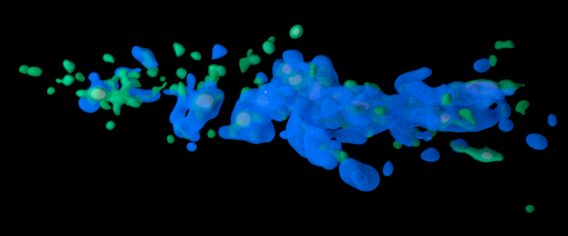
Frame from animation showing higher density bright (green) and hot (blue) regions.

Here's a round up of some of my recent tweets about the solar neighbourhood map.

A link to downloadable 3D meshes:

https://sketchfab.com/kevinjardine

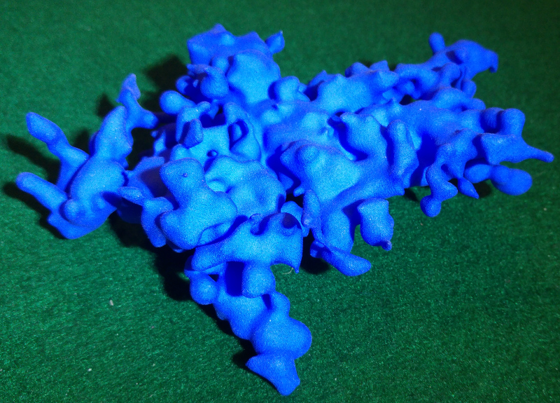
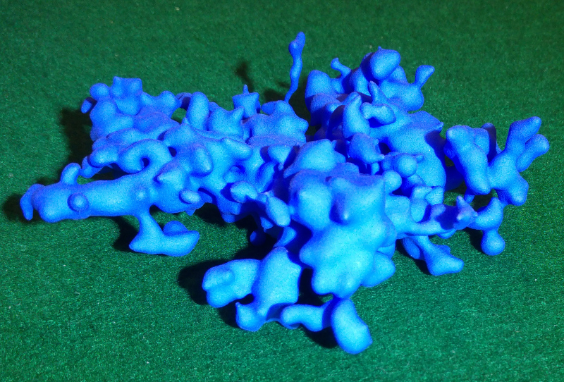
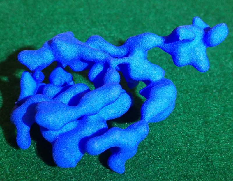
A video showing me unbox a 3D print of the main region in the hot 17% isosurface:

Some still images of the 3D print:

Southern stars with Orion peninsula in the foreground, Per OB3 at left, Sco OB2 at top:

Southern stars. Sco OB2, M7 and LP Trianguli Australis region in foreground, NGC 3532 at left (notice the vertical stream of stars left of Orion!):

Northern stars, Cep OB6 and zeta Cephei complex in foreground, Sheliak highway in background:

(The Sheliak highway is a long stream of stars above the galactic plane that starts in the region surrounding Sheliak (beta Lyrae, at the left of this image) and then extends to the right.)

Here is a Blender animation combining higher density hot (blue) and bright (green) star density meshes. The sun is the dot at the rotation centre:

Pages

Subscribe to RSS - blogs