I've now created the first real face-on map/poster from the Tycho Gaia Astrometric Solution (TGAS) data set that was part of Gaia DR1. The download links for the full resolution version are at the end of this blog post.
TGAS contains parallax data for about 2 million stars, which is most of the Tycho-2 catalog.
Of this data, about half has an error/parallax ratio < 0.2, which is very good. (Keep in mind that this is the precision of the specific measurements. The Gaia DR1 documents warn that in addition the data has a systematic error which is unknown but could be as high as 0.3 milliarcseconds. If the systematic error is really 0.3 milliarcseconds, this would throw off much of the map, especially the regions beyond 300 parsecs. I'm ignoring that for now. In any case, I'll redo all my Gaia maps after DR2 comes out towards the end of 2017. For now, TGAS is the best we have.)
The data with error/parallax ratio < 0.2 goes out to about 700 parsecs or so. The map has a radius of 800 parsecs, which includes pretty well all of the Gould Belt. So this map really shows pretty well all of what most astronomers would consider the solar neighbourhood.
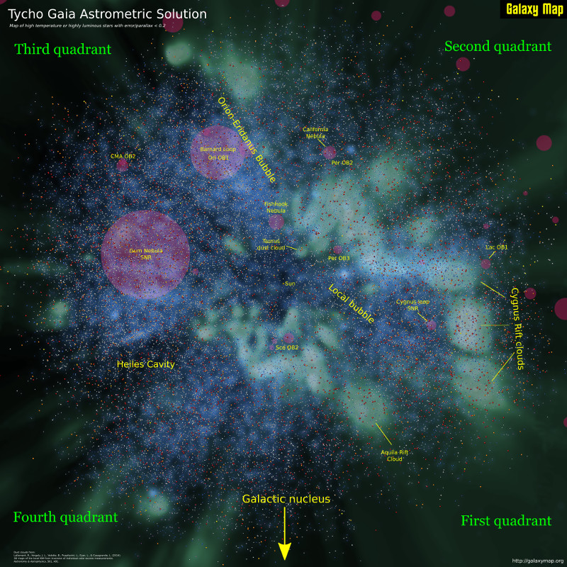
This first map shows only a tiny fraction of the data set: stars with a colour index < 0.1 (meaning that they are very high temperature) or an absolute magnitude < -2 (meaning that they are very luminous). These are the spectacular galactic beacons that might be used as way points in some distant future. There are 50269 of these stars in TGAS with an error/parallax ratio < 0.2.
As this is a map and not just a data dump, I have provided a background to provide some context. The most important background is the face-on dust cloud map provided by this wonderful paper:
Lallement, R., Vergely, J. L., Valette, B., Puspitarini, L., Eyer, L., & Casagrande, L. (2014). 3D maps of the local ISM from inversion of individual color excess measurements. Astronomy & Astrophysics, 561, A91.
which is essential reading for any Milky Way cartographer. This is shown in green.
I have also provided a few of the larger HII regions from the Sharpless, Gum and RCW catalogs. These are shown as red circles.
Finally, I used TGAS itself to create a blue background - this is a weighted density map . Basically what this does is cut the Milky Way into cylinders that go above and below the galactic plane and have a radius of 10 parsecs. I then take the weighted mean of all the stars with a colour index < 0.1 within each cylinder (weighted by the star's estimated temperature) and use the resulting mean with a centre of each parsec to create a luminosity value. Finally I smooth the result using a gaussian blur with a radius of 20 parsecs.
This all sounds complex but takes very little time to do with Python's wonderful scipy/numpy packages.
In a nutshell, the blue background shows where the hot stars are concentrated. These are typically young stars that have not drifted yet from their places of origin.
You can download the full 8192x8192 pixel map poster here (warning, files sizes are a bit over 30 Mb):
This is just a start - eventually you can expect to see a searchable, zoomable, pannable, clickable face-on map of a million TGAS stars on this site but that will take a little more time to pull together.